Case study · Brand identity, packaging & collateral
Members Only Wellness —
access granted,
category disrupted
Client Members Only Cannabis
Scope Full brand identity · Logo system · Packaging · Social media
MarketPremium hemp wellness · US market · Gender-inclusive
Year 2025
The cannabis wellness space has a problem: it still doesn't know who it's talking to. Most brands skew either clinical and cold, or streetwear and loud. Members Only Wellness asked for a third option — a brand that signals premium access, genuine discretion, and the confidence of belonging somewhere worth belonging.
Members Only Cannabis came to me with a strong premise: 50+ years of collective industry experience, a direct pipeline to a digitally engaged audience through 200+ influencer partnerships, and a product range built around real formulation — not just vibes. The challenge was to build a visual identity that honoured that credibility while living comfortably in the intersection of wellness, culture, and intimacy. A brand that could hold "Fast-acting THC gummies for sexual enhancement" in the same visual system as premium brand guidelines — and make both feel inevitable.
The Mark
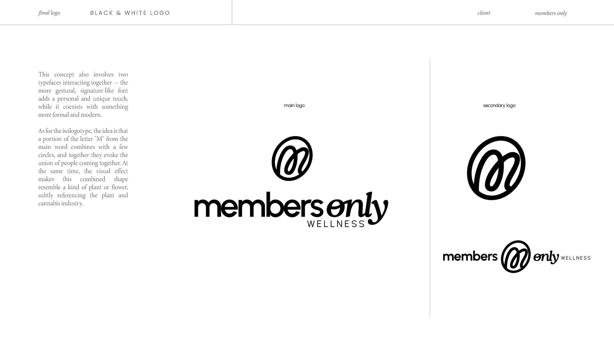
Inside the loop. The M that closes itself into a circle.
The brief asked for a logo that communicated belonging, fluidity, and community. What emerged wasn't designed from the outside in — it grew from a single letterform.
The "M" of Members. Not drawn as a rigid geometric character, but as something that moves: a stroke that begins, curves, and returns to itself. A form that loops. The mark is the letter completing its own gesture — and in doing so, it becomes something else entirely: a circle, an enclosure, a place you are inside of.
That circularity is the entire concept. Membership is not a transaction; it's a space you inhabit. The mark doesn't point outward at an audience — it wraps around them. You're not looking at the brand. You're in it.
The gestural quality of the inner stroke was deliberate. It had to feel hand-drawn enough to carry warmth, and structured enough to anchor a premium identity. A signature that learned to be a system. The outer circle holds the movement without stopping it — the form suggests rotation, rhythm, something continuously in motion but always contained. Fluid and bounded at once.
The mark doesn't announce membership. It enacts it. You're either inside the loop, or you're not.
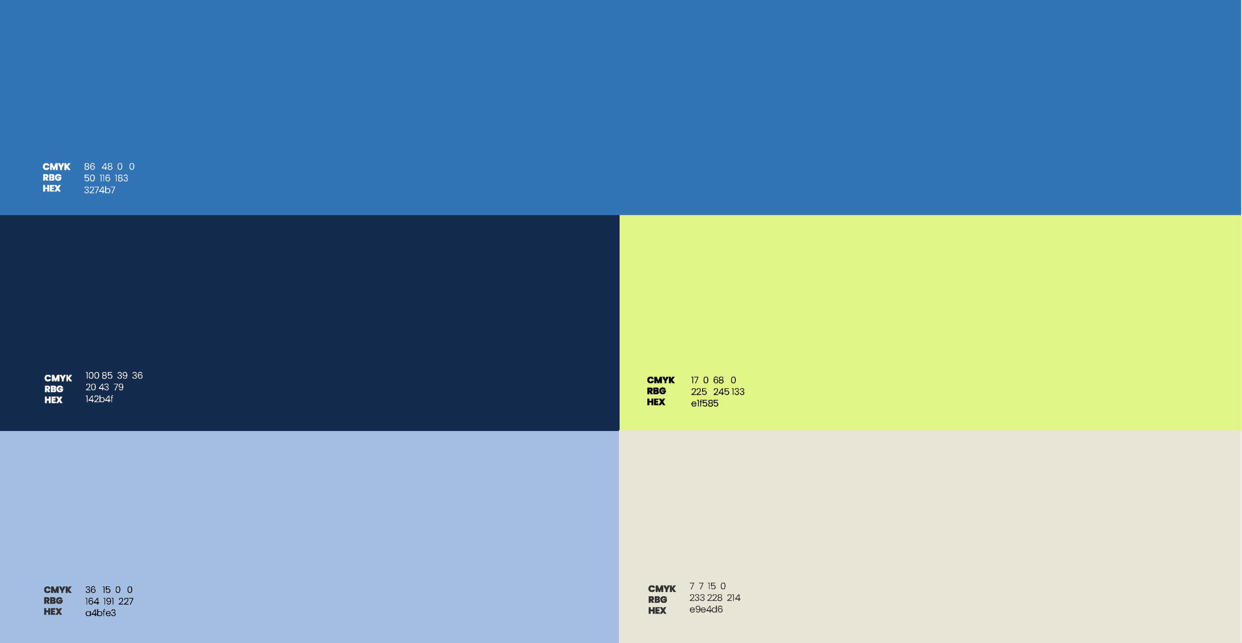
A palette that earns its confidence — the tension between cool authority and warm invitation
Most cannabis wellness brands reach for forest green, warm terracotta, or clinical white. Members Only needed to look like none of them — while still reading as premium, trustworthy, and distinctly grown-up.
Steel Blue (#3274b7) does the heavy lifting: confident, direct, gender-neutral, and premium without being corporate. It's the brand's primary voice. Lime Green (#e1f585) is the contrast character — high-energy, unexpected, and distinctly alive. Together they create the visual equivalent of the brand premise: something you wouldn't expect, but immediately recognise as right.
Prussian Blue anchors the dark moments — packaging blocks, text fields, and any context requiring authority. Cornflower and Ivory breathe. Old Rose does something more specific: it marks the feminine line of the product range (the Mojo gummies for women) with softness and directness in equal measure, without ever tipping into the sentimental pink that the category usually reaches for. The palette works because each color has a job, and none of them compete.
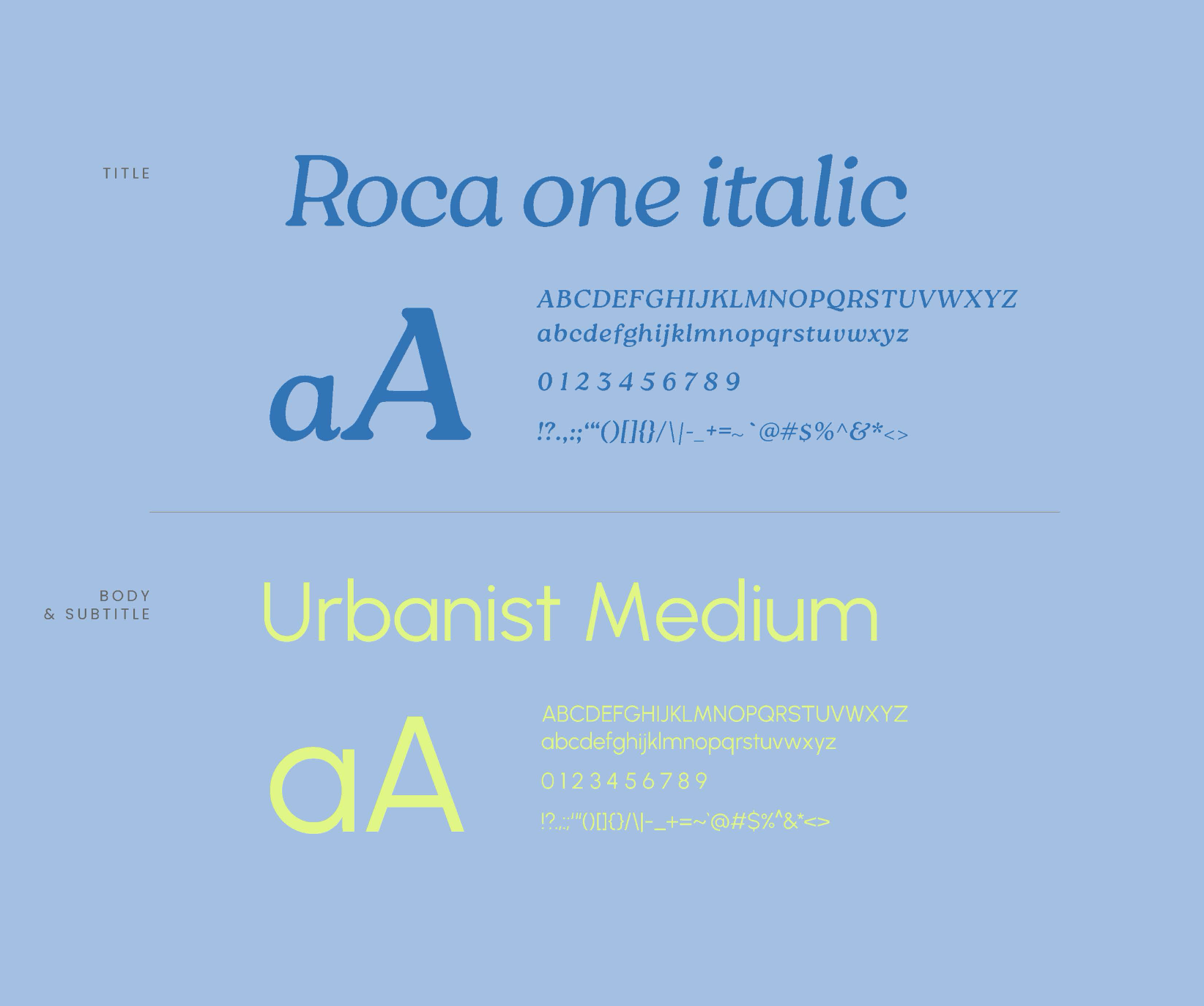
Two typefaces, one conversation — the tension that makes the system feel alive
Roca OnePrimary — Display & subtitlesItalic · Warmth, authority, character
UrbanistSecondary — Body & UIMedium · Clean, modern, legible
Roca One Italic leads all display moments — the product names, the brand headlines, the large-format retail applications. It carries personality without affectation: enough warmth to feel human, enough structure to feel credible. Urbanist Medium handles the system — body text, labels, UI type, and any context where neutrality serves the content. The pairing works because they share geometric foundations but diverge at the moment of expression: Roca is the signature, Urbanist is the infrastructure.
One system, three audiences — packaging designed to declare intent without shouting
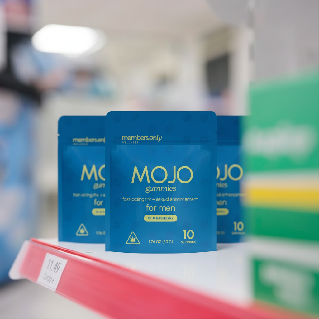
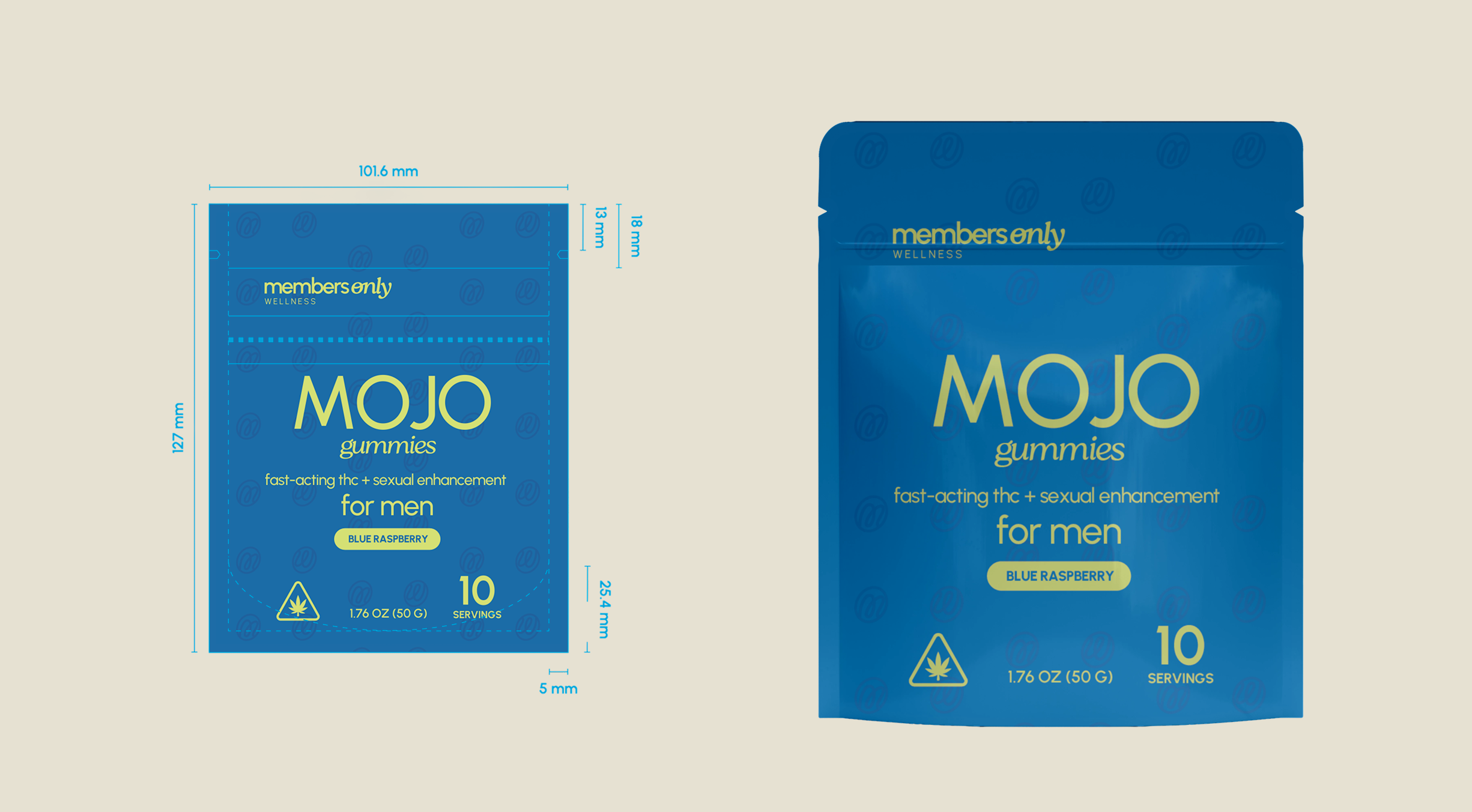
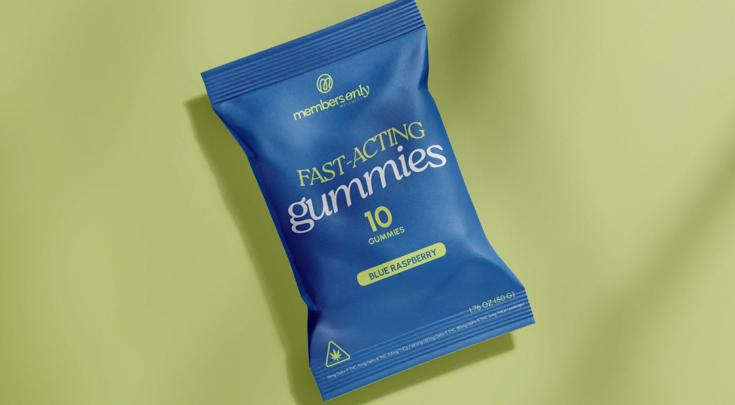
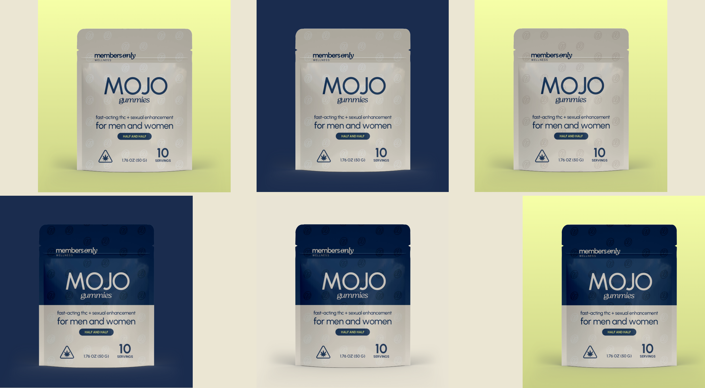
The product range required a packaging system that could visibly differentiate between the general fast-acting gummy line and the Mojo line (sexual enhancement, THC + natural enhancers), while remaining unmistakably part of the same brand family. The solution lives in the color blocking.
The standard gummies carry the core palette across four variations — different color combinations stress-tested to ensure each reads with the same brand confidence regardless of background context. The Mojo line introduces the gender split through the color system: Steel Blue for men, Lime Green with Old Rose for women, and a combined treatment for the "for men and women" variant. The mark appears as a watermark pattern on every pack — not branded decoration, but structural texture that gives the packaging depth without additional visual noise.
The packaging doesn't describe the product. It describes the person who uses it. That distinction is the entire strategy.
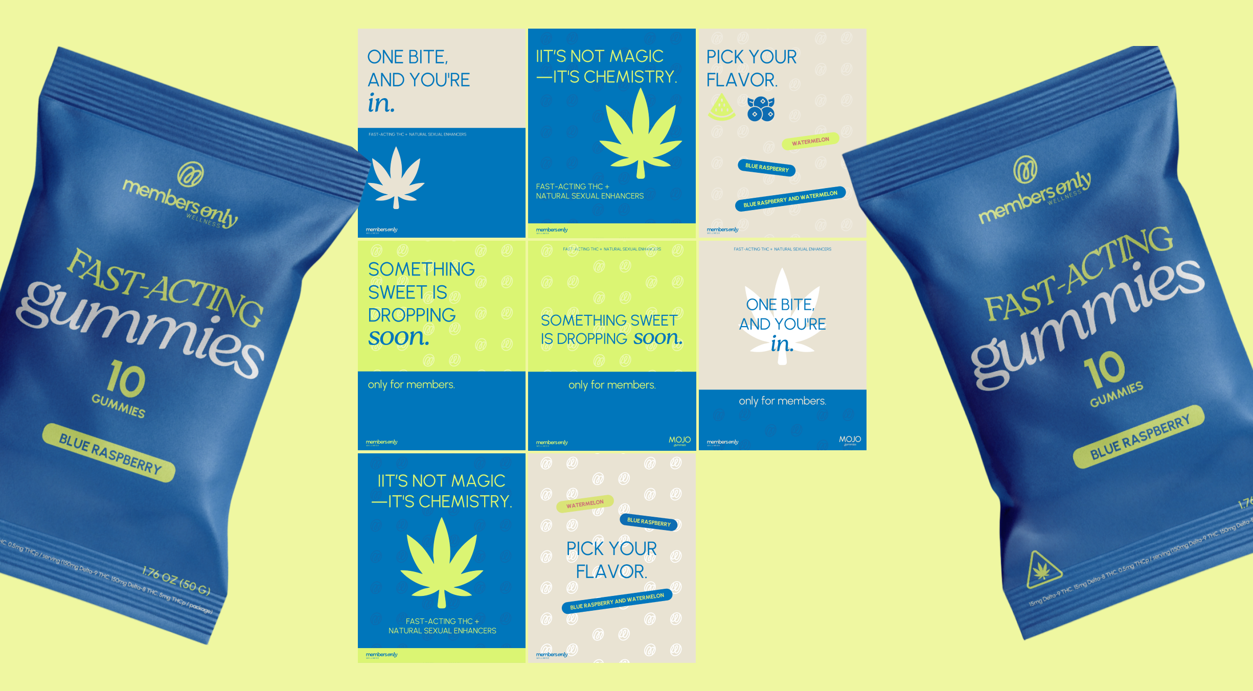
Members Only Wellness launched with a visual identity as confident as its premise — a brand built for a category that needed disrupting. The system is designed to scale: new SKUs, new channels, new markets. The mark holds up at any size, any color, any format. That's not an accident. That's the point.