Case study · Brand identity & design system
Steadi — designing
steadiness into form
Client Vital Earth Labs
ScopeFull brand identity · Packaging · E-commerce
MarketWomen's wellness · US supplements
There is a moment in a woman's life that has long been treated as a crisis to manage. I wanted to design a brand that treated it as something else entirely — a transition to move through with clarity, composure, and a quiet kind of power.
Steadi came to me as a brief, a vision, and a gap in the market. Vital Earth Labs had identified what every woman in her 40s already knows: the supplement category for perimenopause and menopause is cluttered with clinical anxiety — boxed layouts, symptom-first messaging, brands that feel like they're treating a problem rather than accompanying a person. The brief asked for something different. It asked for steadiness.
"The category is built around the language of loss. We wanted a brand built around the language of equilibrium."
The strategic premise — Perimenopause as beginning, not ending
The hormonal shifts that begin in perimenopause are the body's first movements in a long choreography — one that can last decades. Most brands enter this conversation with urgency, positioning themselves as relief from symptoms. Steadi needed to enter it differently: as a steady companion for the whole arc, from the earliest hormonal fluctuations through menopause and beyond.
This framing shaped everything. The brand couldn't feel reactive. It had to feel continuous. The visual language couldn't spike or alarm — it had to breathe. The identity system needed to work as well on a first bottle as on an entire product line five years from now.

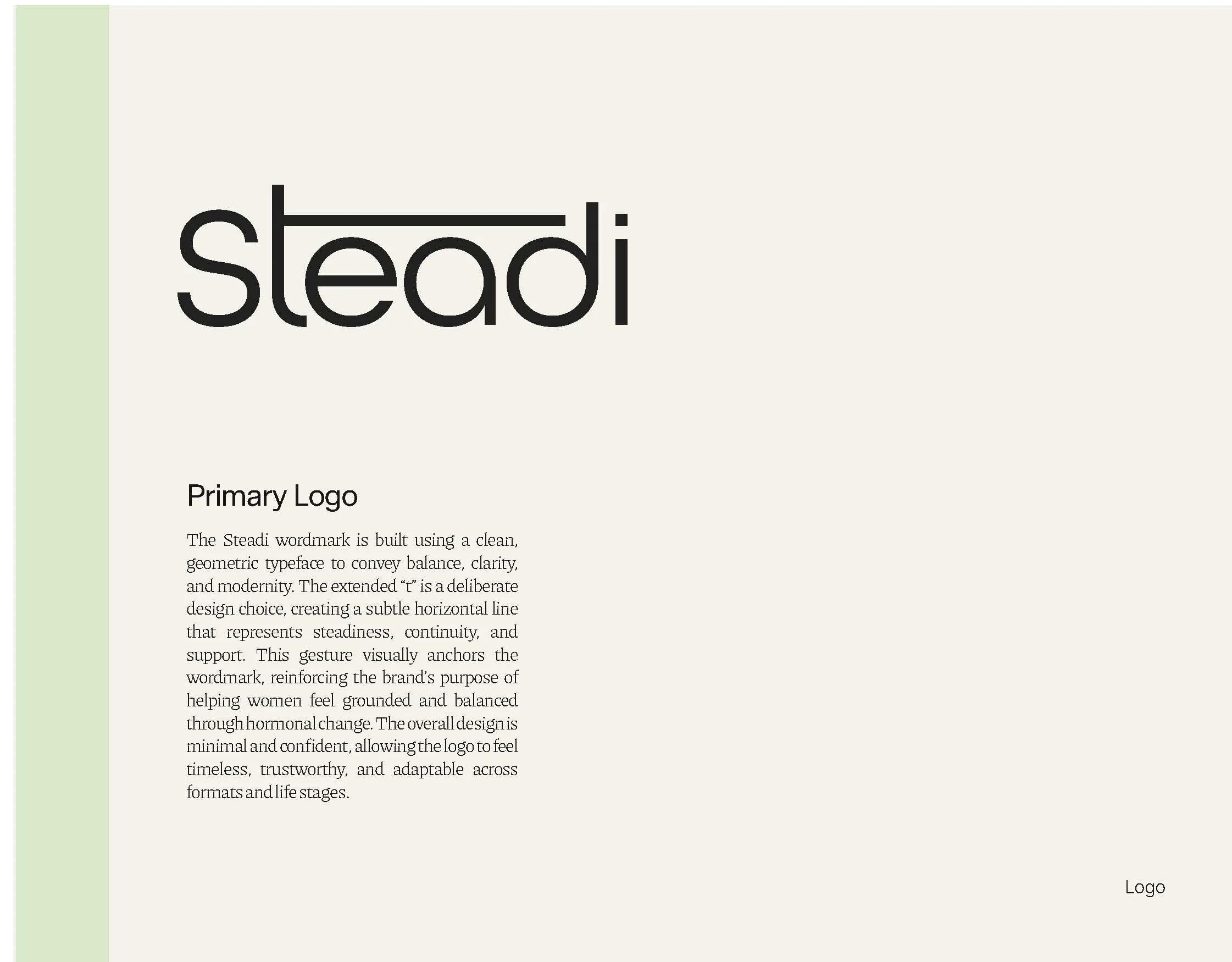
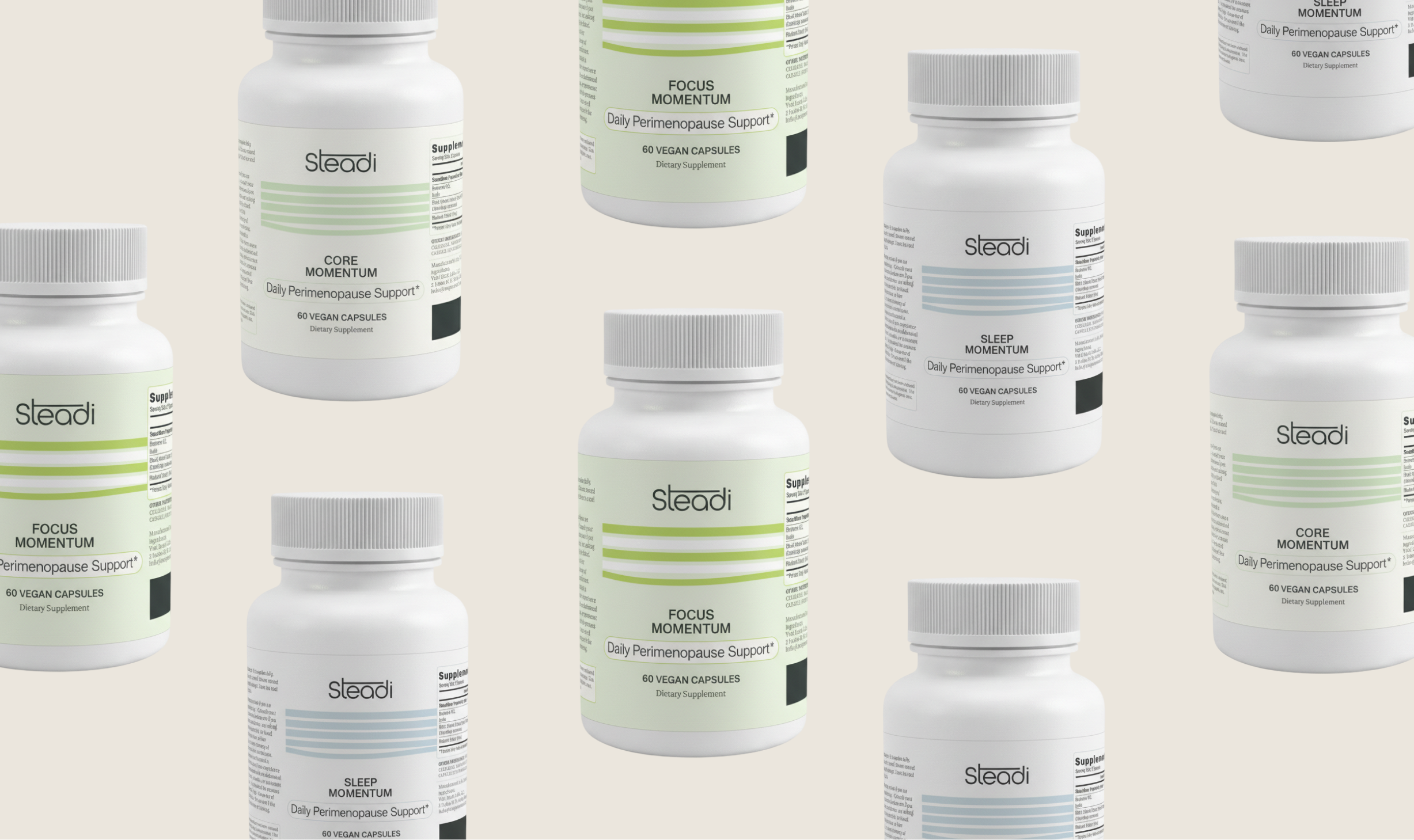
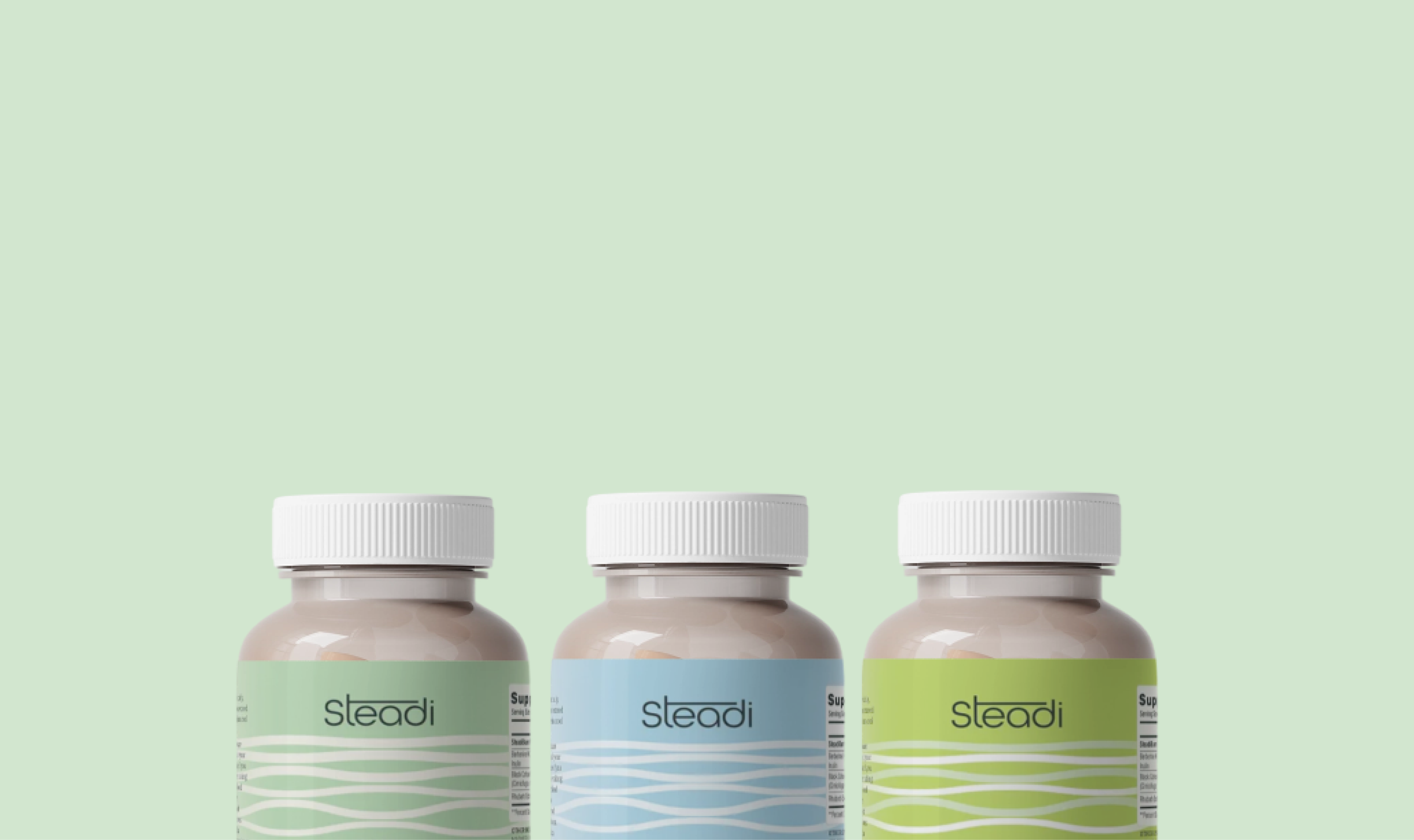
Logo & wordmark — The dot above the i is not a detail. It is the idea.
The brief requested a custom wordmark with an optional abstract motif. The opportunity was immediately clear: the dot above the letter i in "Steadi" is a moment of punctuation — a pause, a point of stillness. In a word that already holds the concept of steadiness, that small mark carries enormous weight.
I developed the dot as a centring device — a visual metaphor for equilibrium, for the body finding its own point of balance. Refined, geometric, deliberate. Not decorative, but load-bearing. The wordmark uses a humanist geometric sans with softened proportions: modern enough to signal credibility in a DTC supplement context, warm enough to feel genuinely feminine without relying on any of the usual tropes.
The mark needed to feel like it had always existed — the kind of logo that makes you wonder why no one had thought of it before.


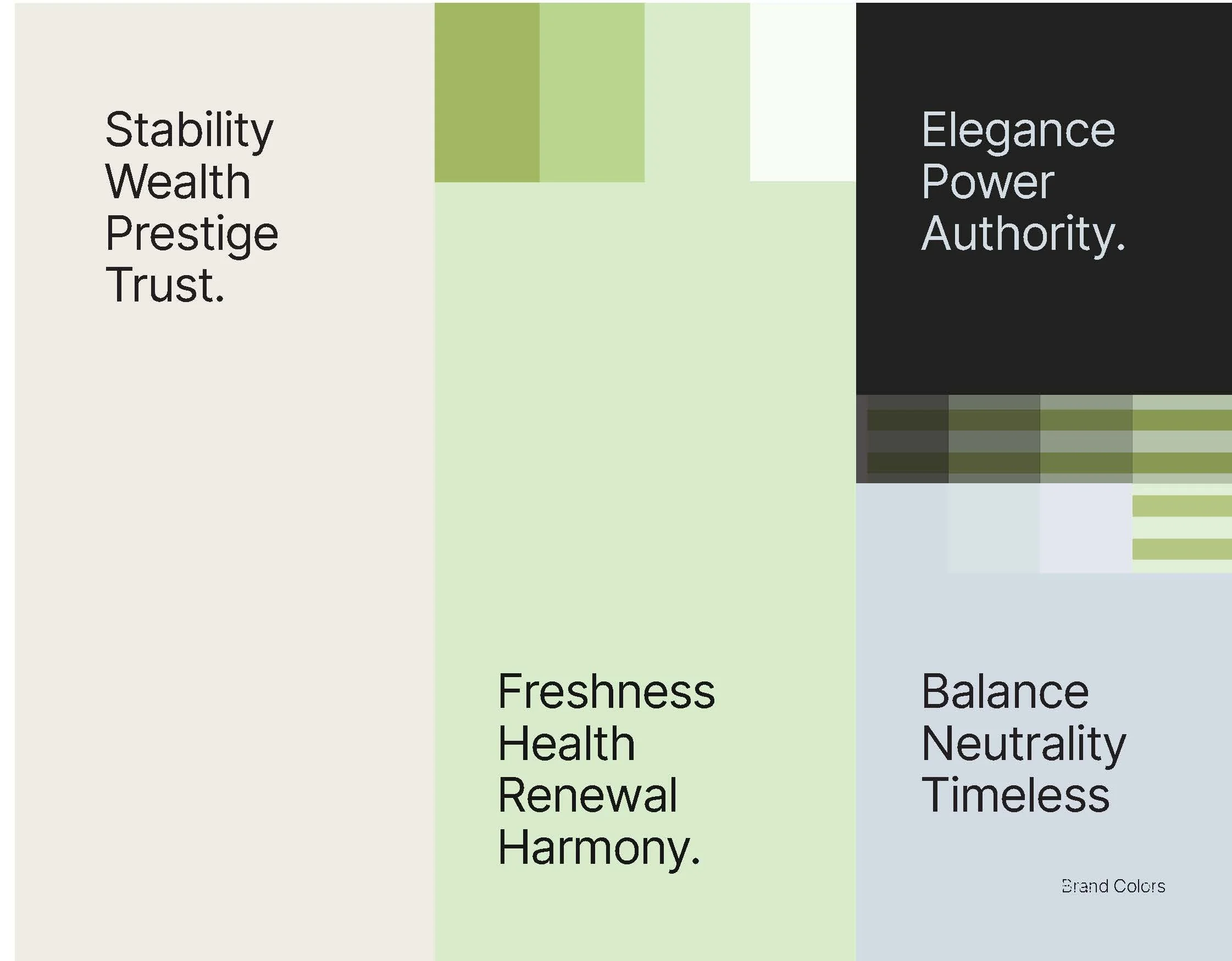
Palette & visual language—
color as a felt experience, not
a category signal
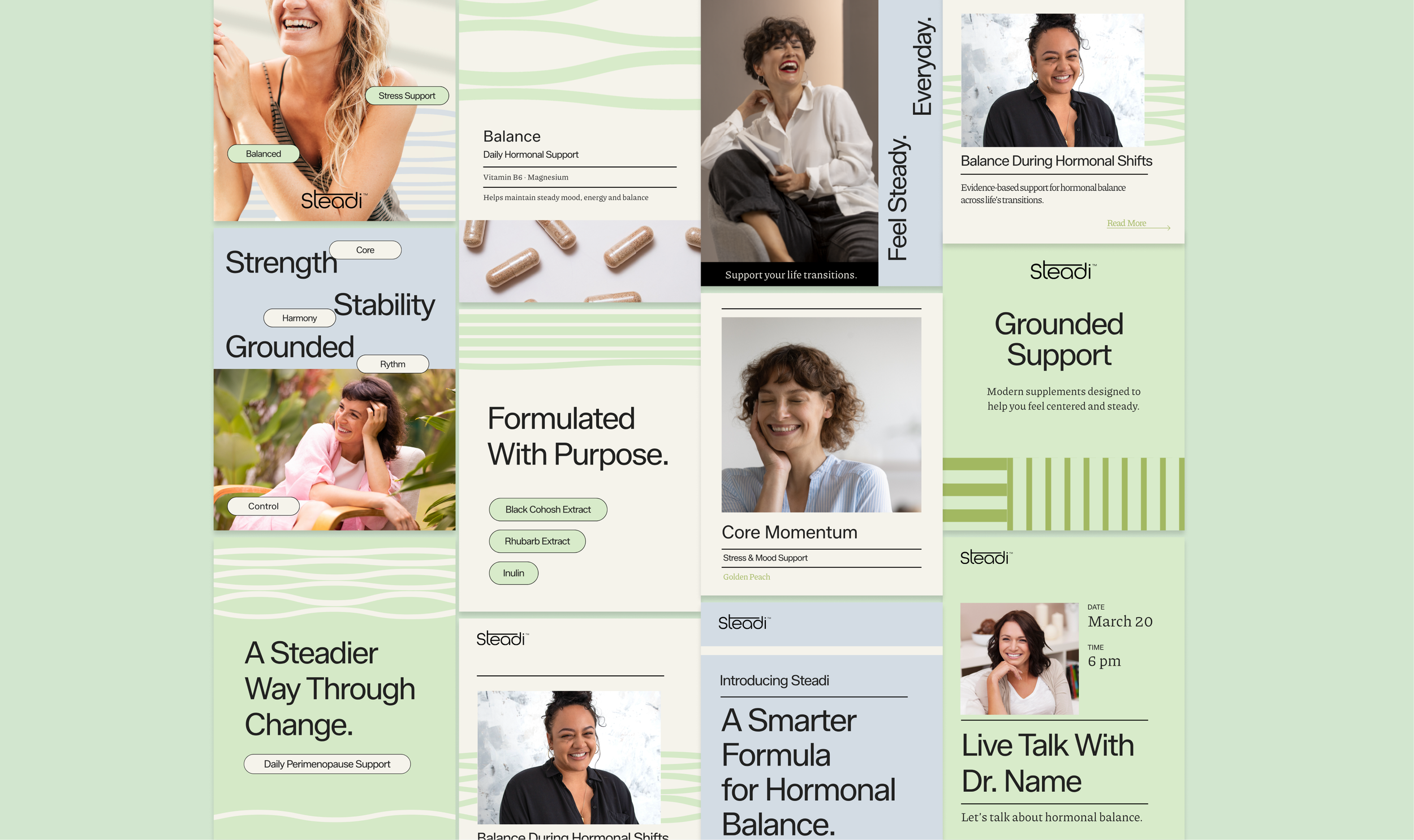
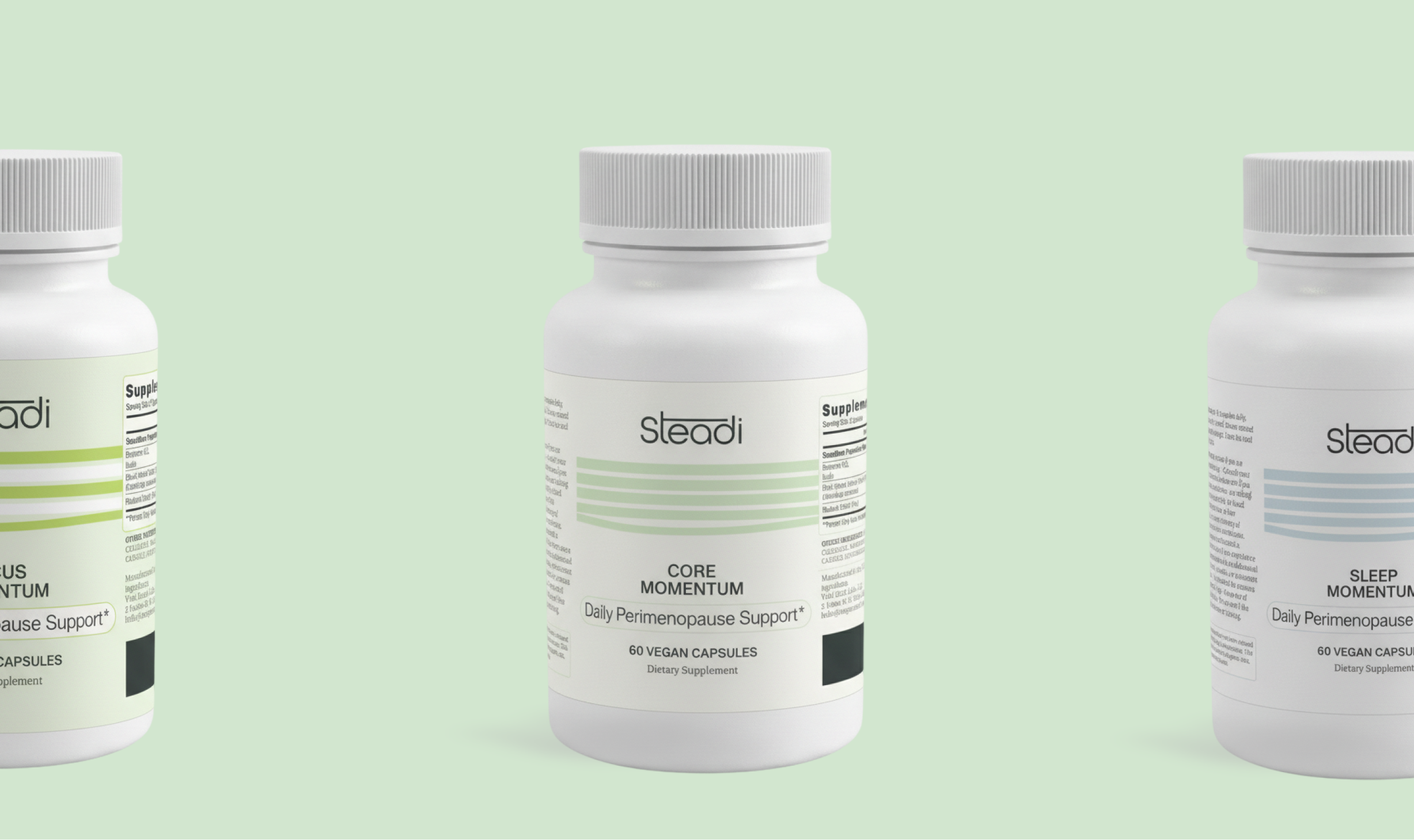
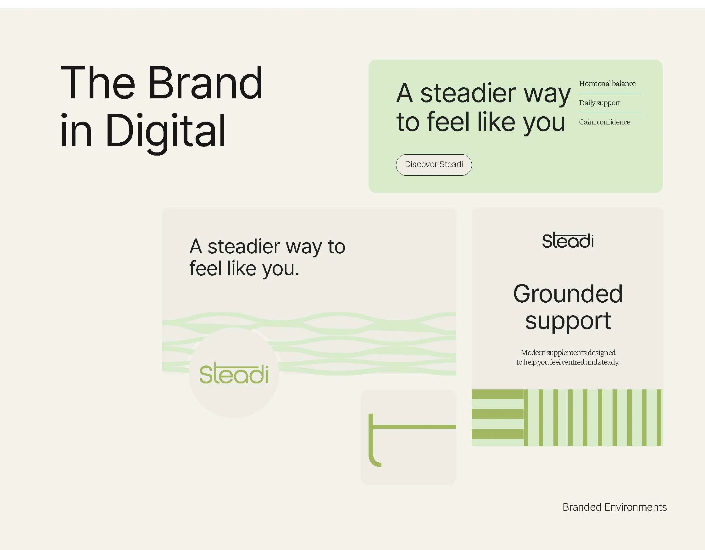
The women's wellness category defaults to lavender, blush, and sage — colours that signify calm without actually creating it. Steadi needed a palette that felt genuinely grounded: earthy without being dull, sophisticated without being cold, and expansive enough to carry a growing product line.
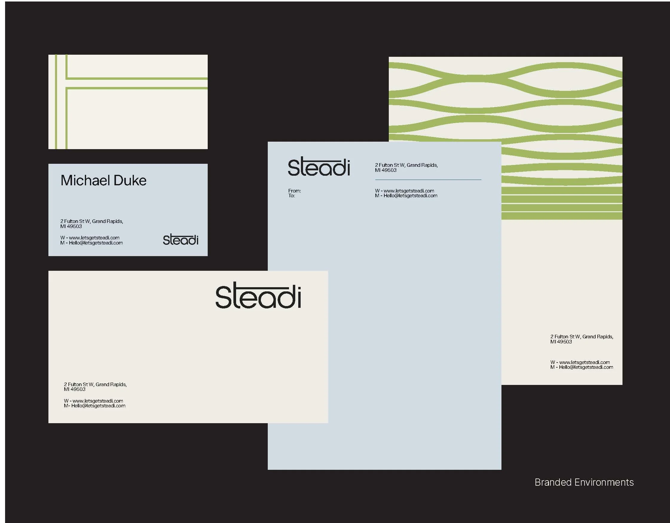
The palette works in registers — deeper tones that anchor the brand identity, lighter tones that breathe across packaging and digital. The graphic language draws from the same conceptual well as the mark: gentle wave forms, open spacing, and a geometry that suggests rhythm rather than rigidity. Hormonal fluctuation rendered as something fluid and knowable, not frightening.
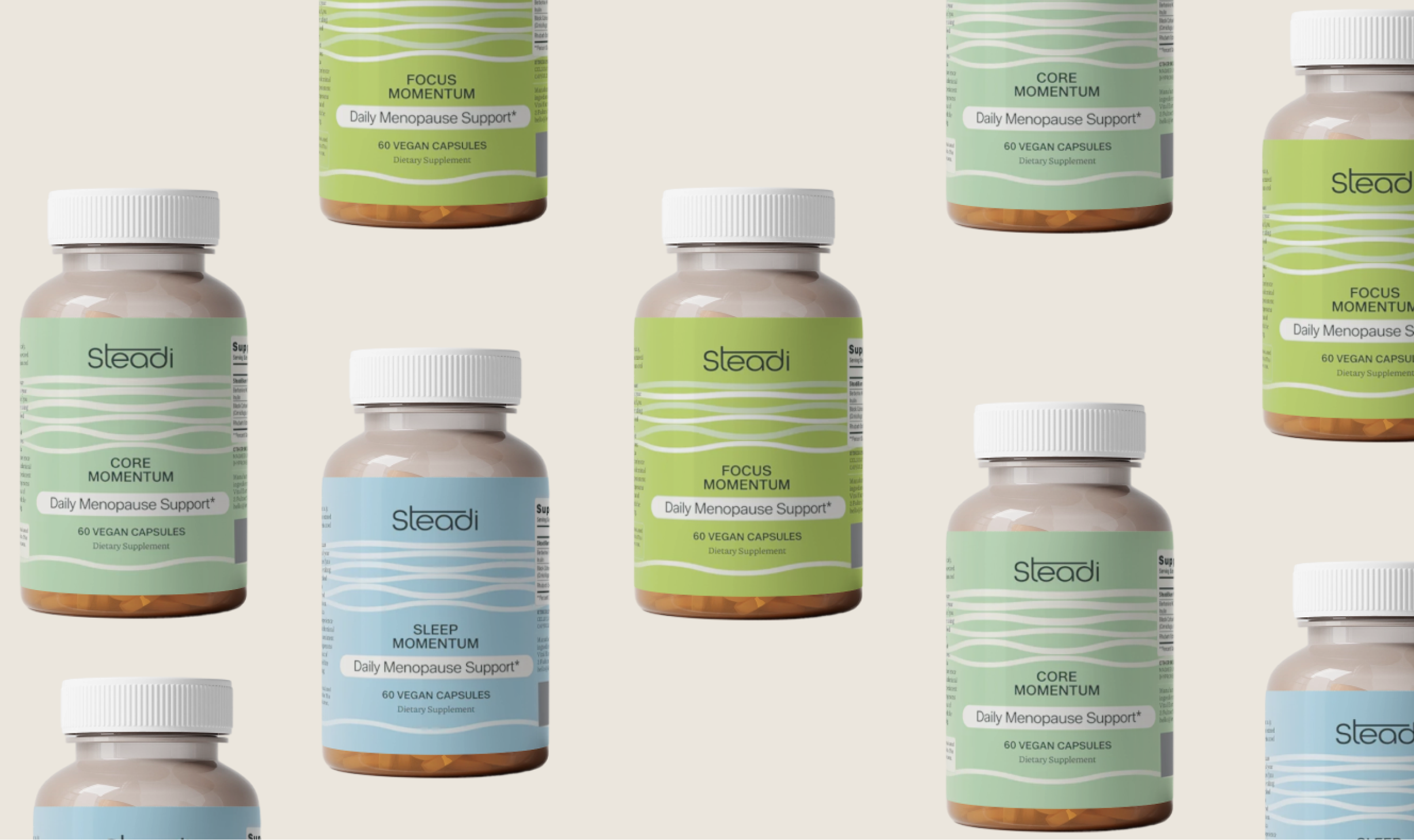
The line as strategic device — movement, imbalance, and the return to self
Every element in the Steadi visual system is intentional, but none more so than the line.
Across the brand — in the graphic language, the layout system, the packaging structure — I introduced a recurring motif of lines that drift, curve, and resolve. Not erratic, not broken: moving. Lines that know where they're going but take a human path to get there.
The concept is direct: hormonal imbalance is not a malfunction. It is the body in motion, oscillating between states that have always existed in nature. The slight undulation in Steadi's graphic lines is a visual translation of that reality — the body's natural fluctuation rendered visible, and made beautiful. A wave is not a flaw in the water.
What the lines also do, structurally, is return. They wander from the grid and come back to it. That return is the brand promise made visible: Steadi doesn't eliminate the movement. It accompanies you through it, and helps you find your centre again. Steadiness is not rigidity. It is the capacity to move and still know where you stand.
This is why the lines are never jagged, never anxious. They are curious. They are the graphic equivalent of a deep breath.
Steadi has launched to market. The identity was built to scale — Steadi Rest, Steadi Defense, Steadi Sharp — each extension already lives within the system, waiting.
The brand enters a category that needed disrupting, and does so without raising its voice.