I joined the project as part of a small creative team during a key moment of brand evolution — helping transform an early visual foundation into a more cohesive, modern, and emotionally resonant brand system.
While the core logo had been developed prior to my involvement, I led the expansion and execution of the visual identity across packaging, ecommerce, marketing, and customer-facing touchpoints.
The goal was clear:
To create a brand experience that felt modern yet approachable — built for busy, health-conscious mothers seeking products they could trust while navigating a new stage of life.
Reimagining a modern wellness brand for motherhood
Client Mommy Knows Best
ScopeFull brand identity · Packaging · E-commerce
MarketWomen's wellness · US supplements
Mommy Knows Best is a wellness brand designed to support women through pregnancy, postpartum, breastfeeding, and early motherhood.

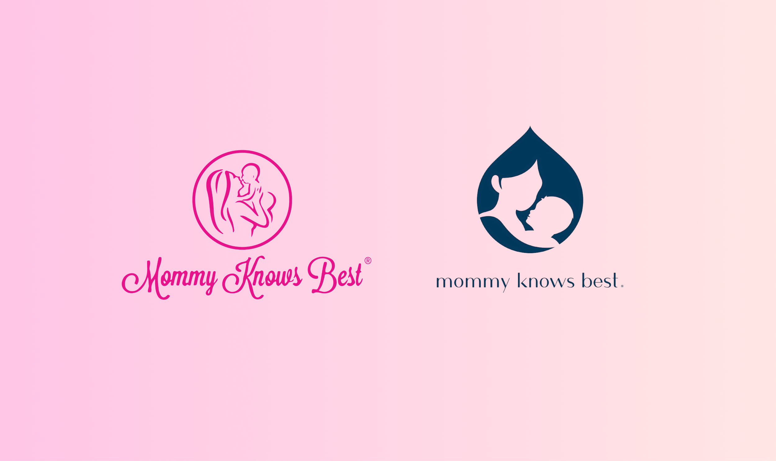
LOGO TRANSFORMATION
OLD BRANDING
The Challenge
The existing brand lacked consistency and visual cohesion across products and digital channels. As the product line expanded, there was an opportunity to create a stronger, more recognizable identity — one that could better reflect the warmth, credibility, and optimism behind the brand.
The visual system needed to feel:
Trustworthy, modern, uplifting, and approachable — balancing clinical credibility with emotional connection.
Most importantly, it needed to resonate with a very specific audience:
Modern mothers who care deeply about wellness, want the best for themselves and their babies, and are learning to
navigate motherhood while still feeling like themselves.
The
Approach
Building on the existing logo foundation, I helped shape and systematize the broader brand language to create greater consistency across every touchpoint.

Building on the existing logo foundation, I helped shape and systematize the broader brand language to create greater consistency across every touchpoint.
The visual direction focused on creating a world that felt:
Warm, friendly, modern, and optimistic — introducing a softer, more approachable aesthetic while maintaining trust and clarity in a highly competitive wellness category.

This included refining color systems, typography usage, packaging hierarchy, visual consistency, product storytelling, and ecommerce communication to ensure the experience felt unified across channels.
Particular attention was given to creating a balance between:
Clinical trust + emotional warmth
Functionality + delight
Wellness credibility + modern motherhood
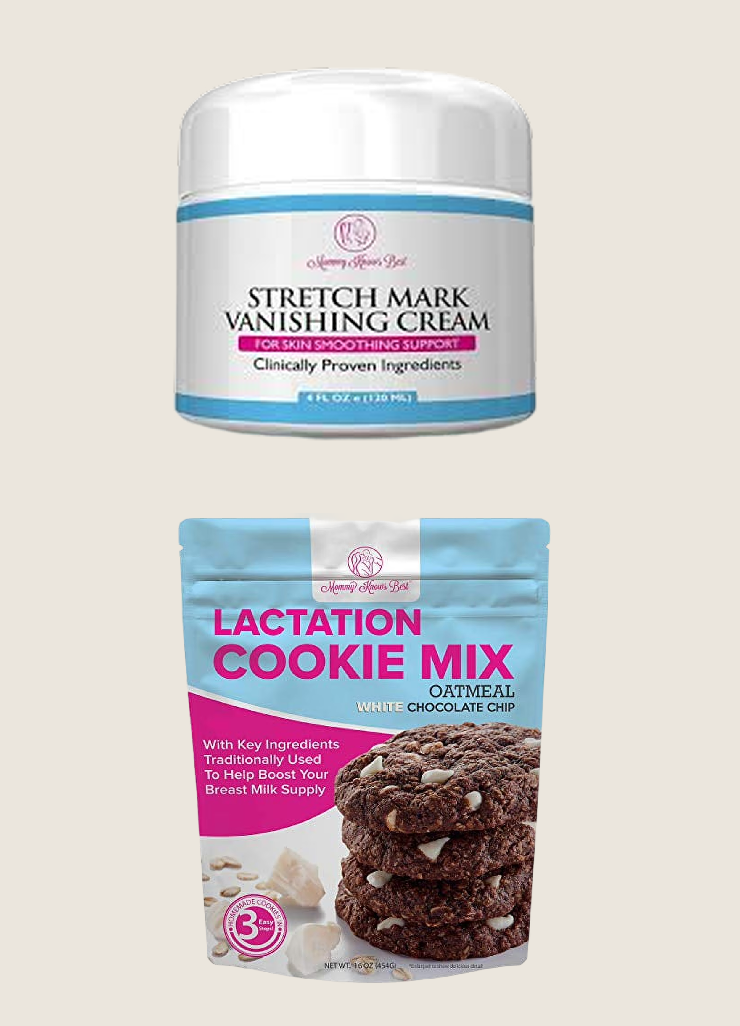
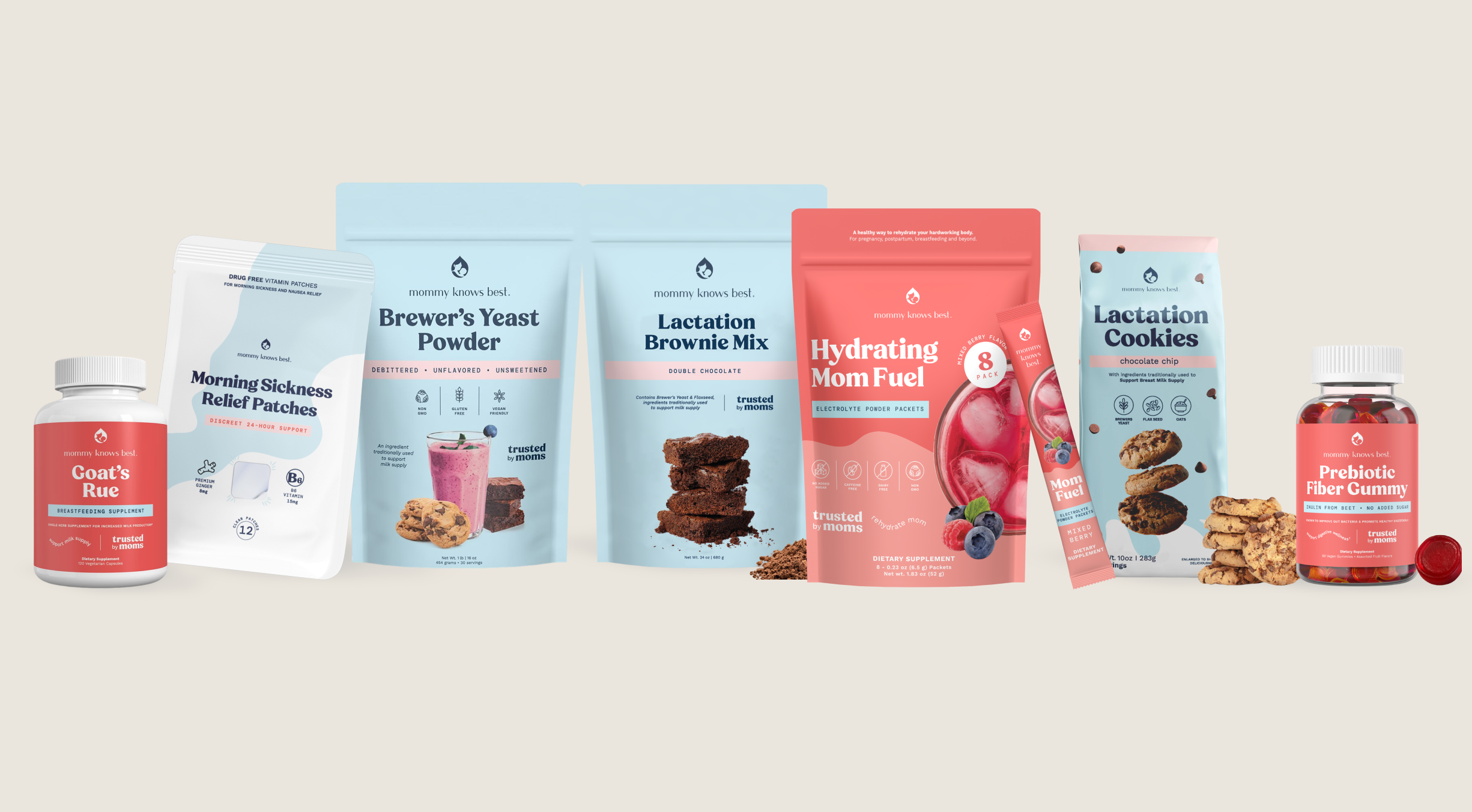
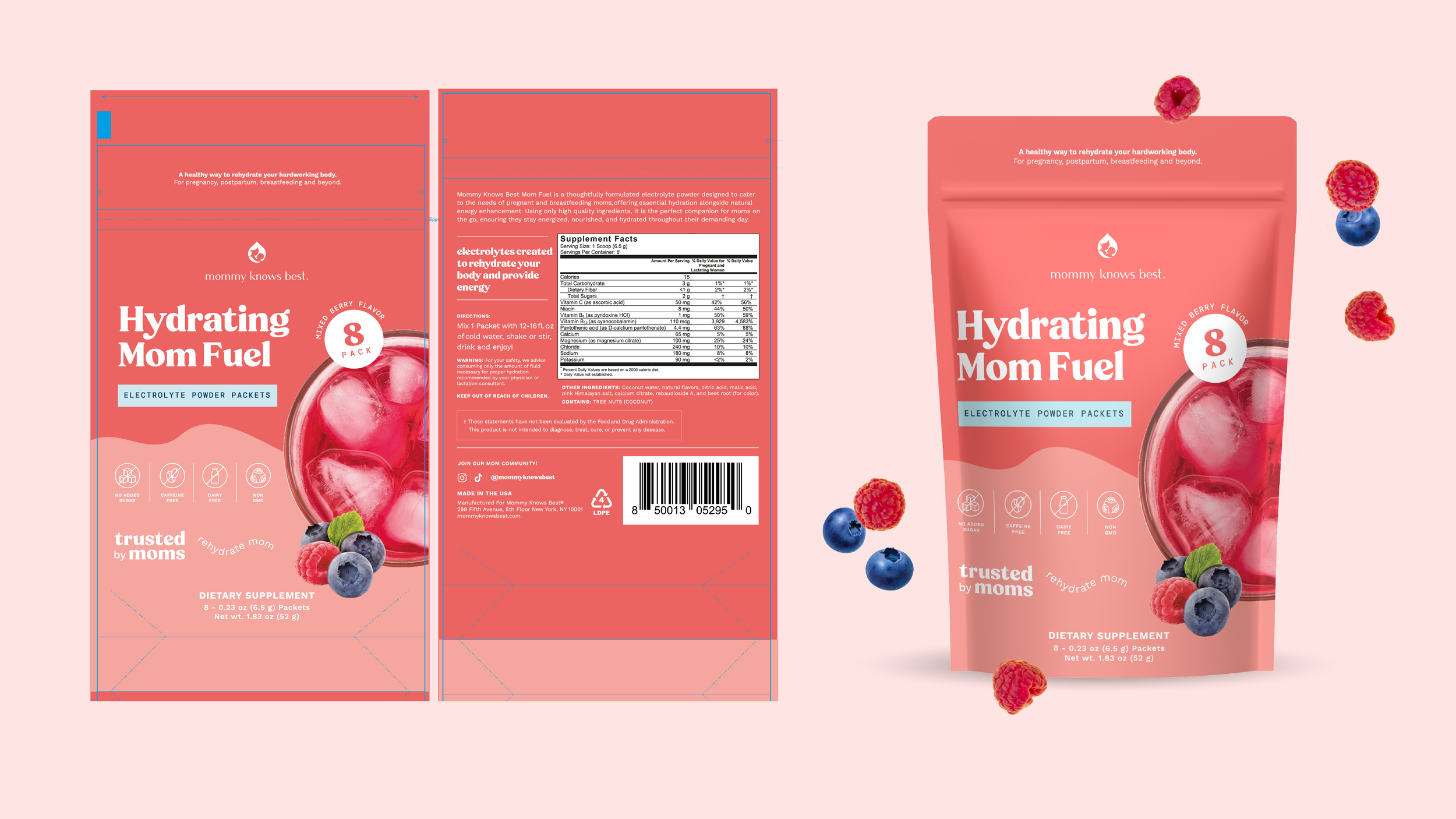
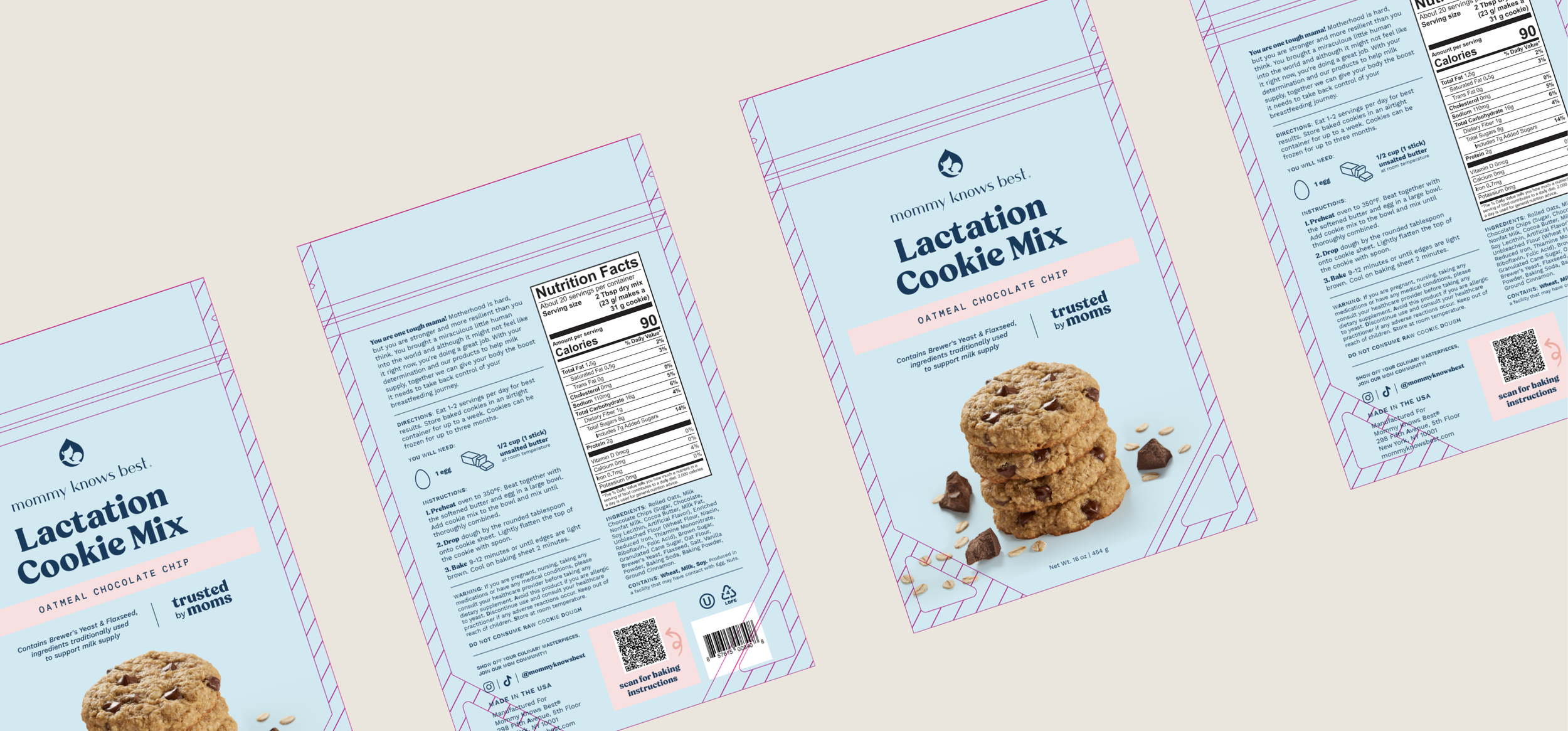
Packaging System Development
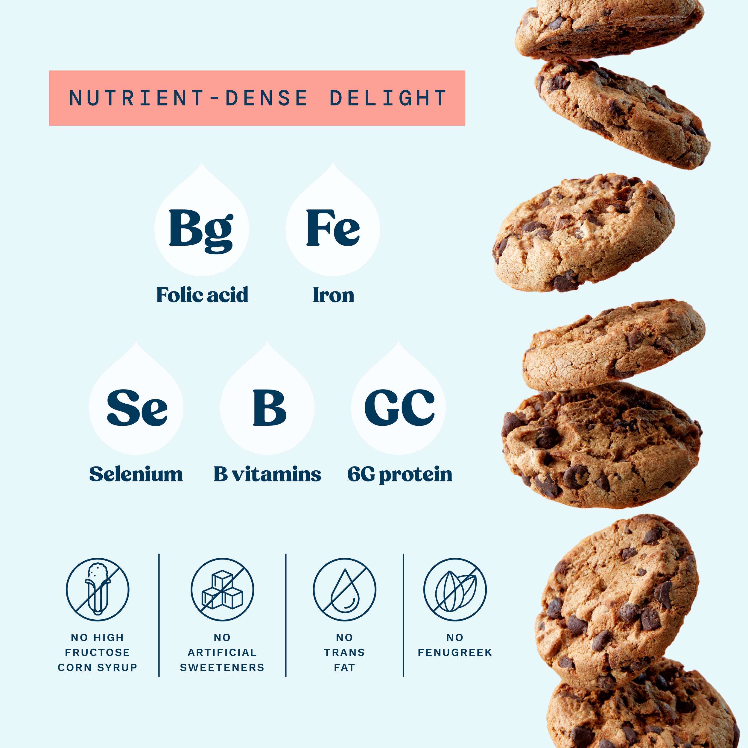
A key part of the rebrand was developing a scalable packaging system across 30+ SKUs, including bottles, pouches, powders, and stick packs.
The focus was creating a strong balance between legibility, consistency, and emotional appeal — establishing a clear typographic hierarchy for titles, subtitles, benefits, dosage information, and front-panel communication to improve clarity and trust.
At the same time, the system was designed to maintain a strong sense of familiarity across formats, ensuring every product felt cohesive, recognizable, and unmistakably part of the same brand family while remaining easy to navigate for modern mothers.
This resulted in a packaging ecosystem that felt warm, approachable, modern, and highly functional across every touchpoint.
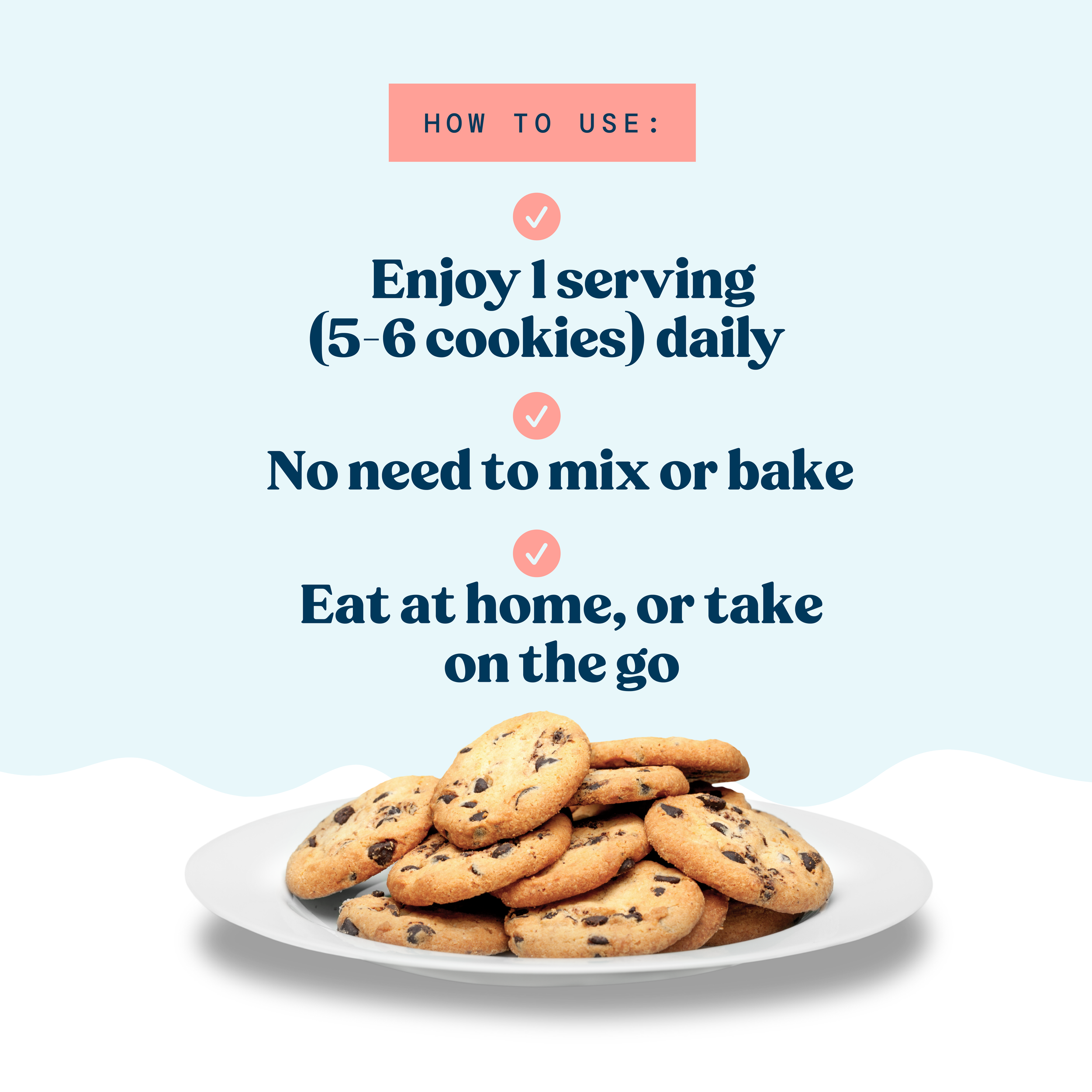
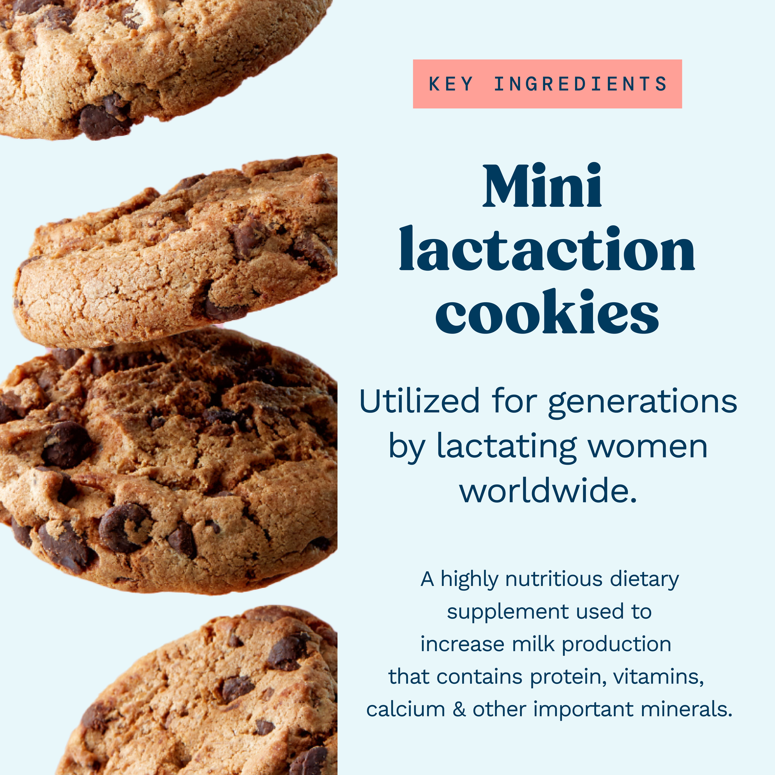
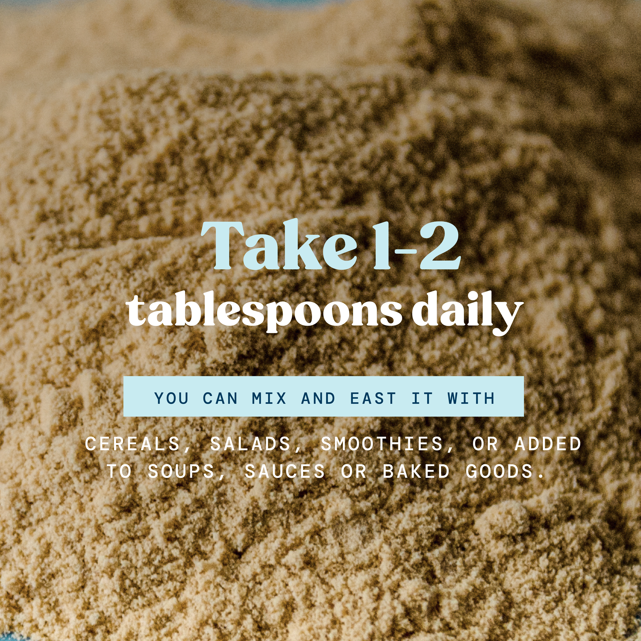
Amazon Listings & Digital Product Experience
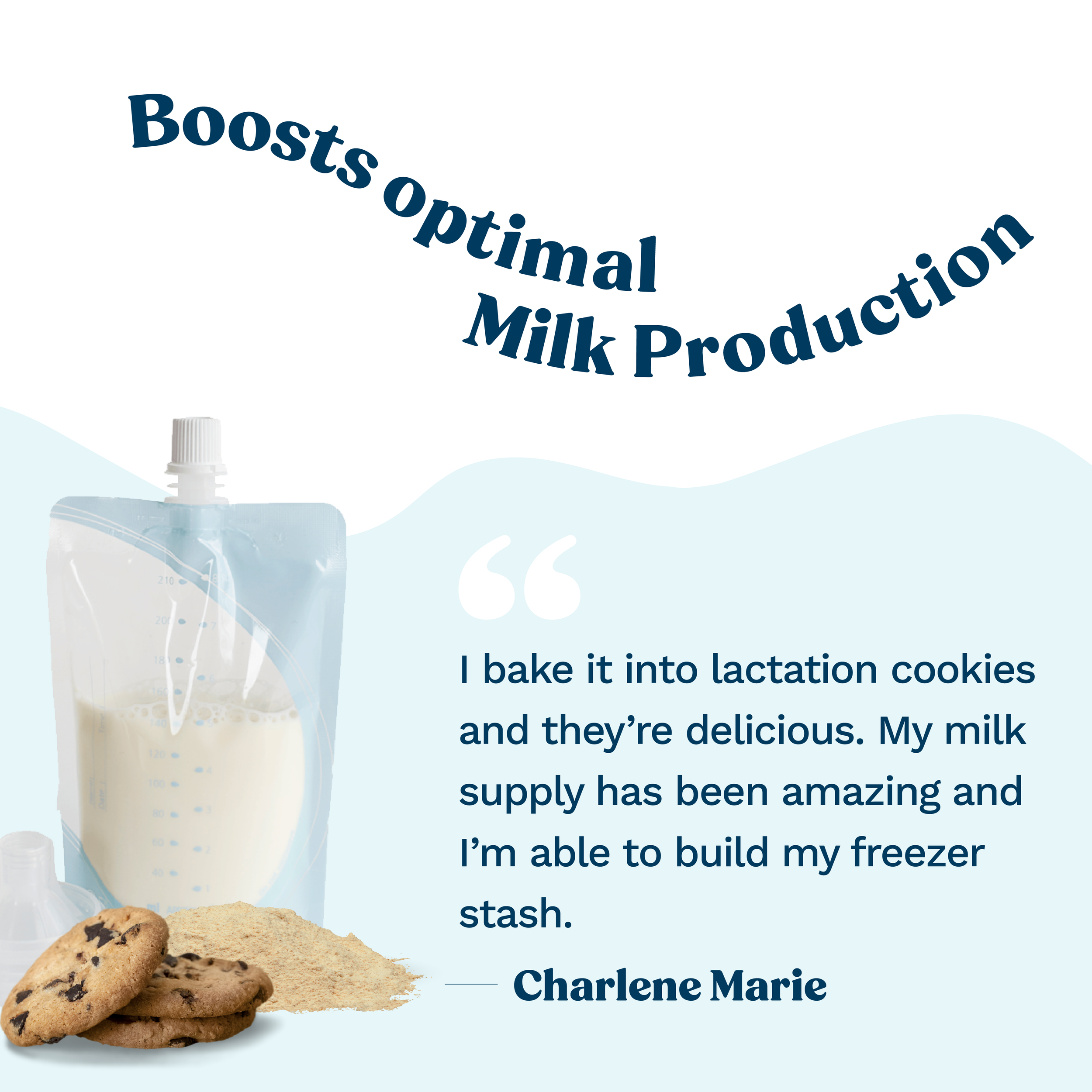
As part of the rebrand, I led the complete redesign of 30+ Amazon product listings, reimagining the brand’s visual presence across one of its most important sales channels.
The work included the full redesign of Amazon storefront and product front pages, creating a more cohesive, modern, and conversion-focused customer experience aligned with the new brand direction.
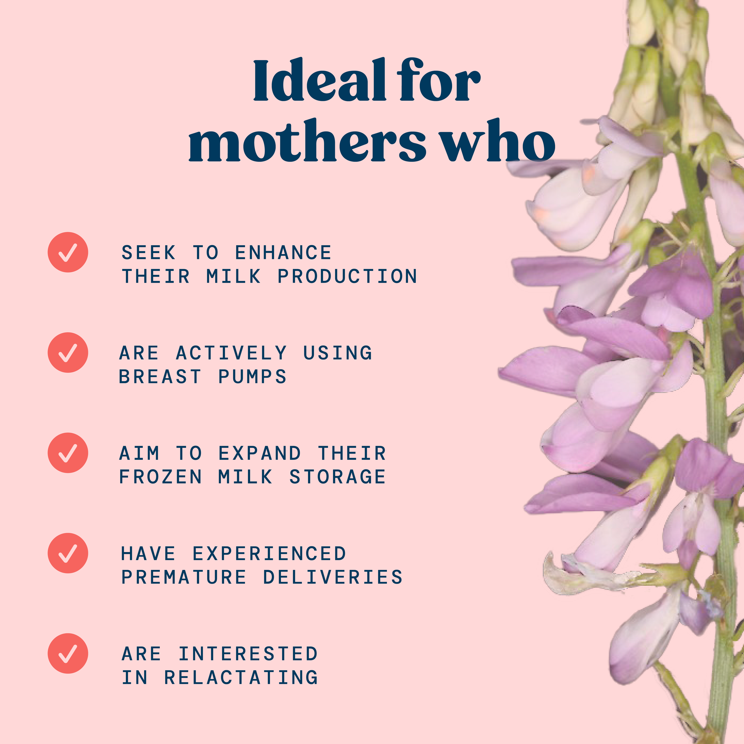
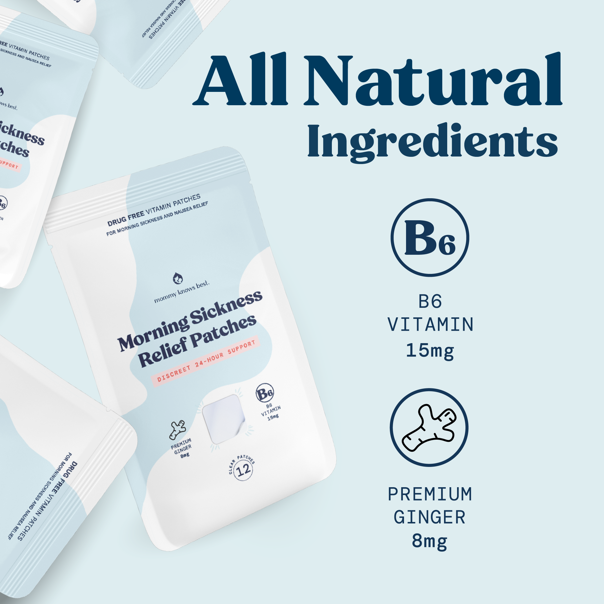
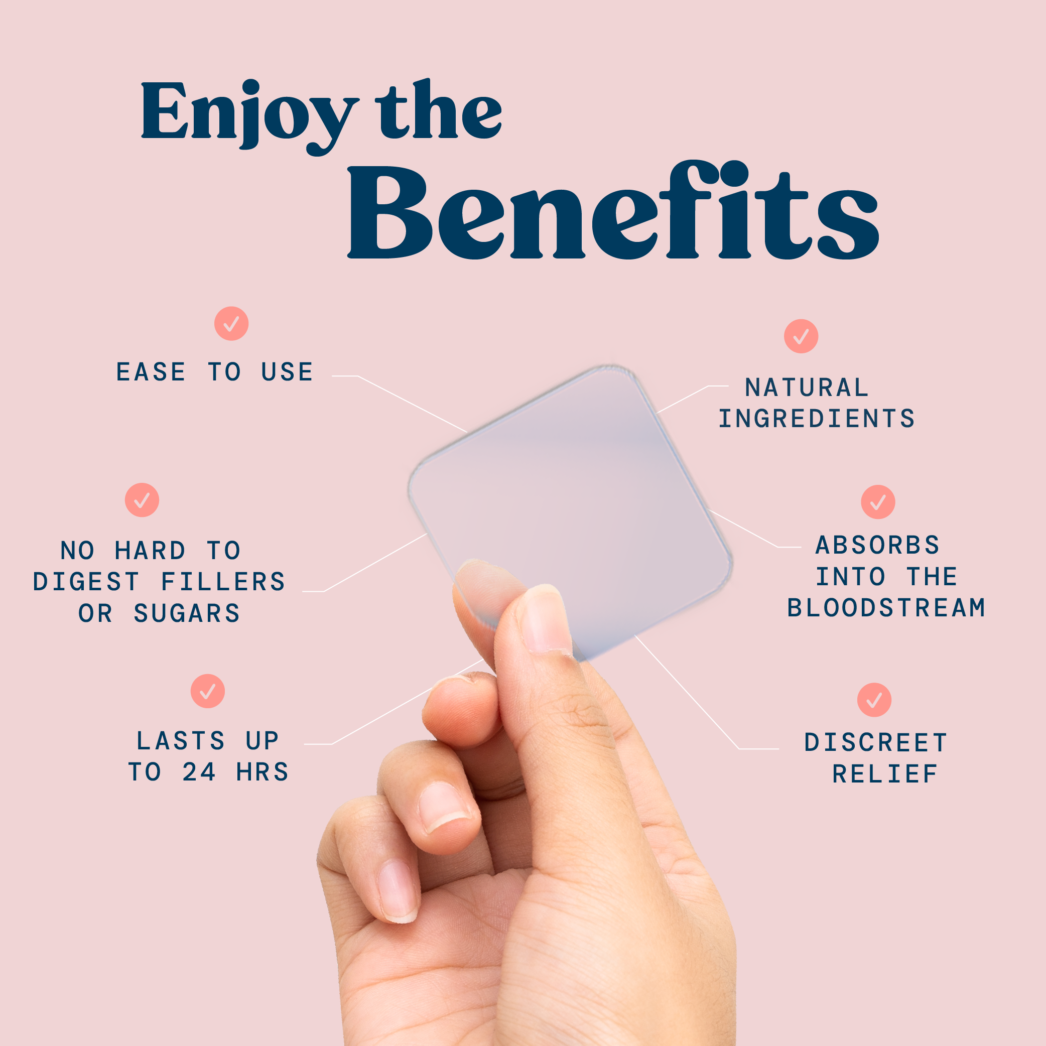
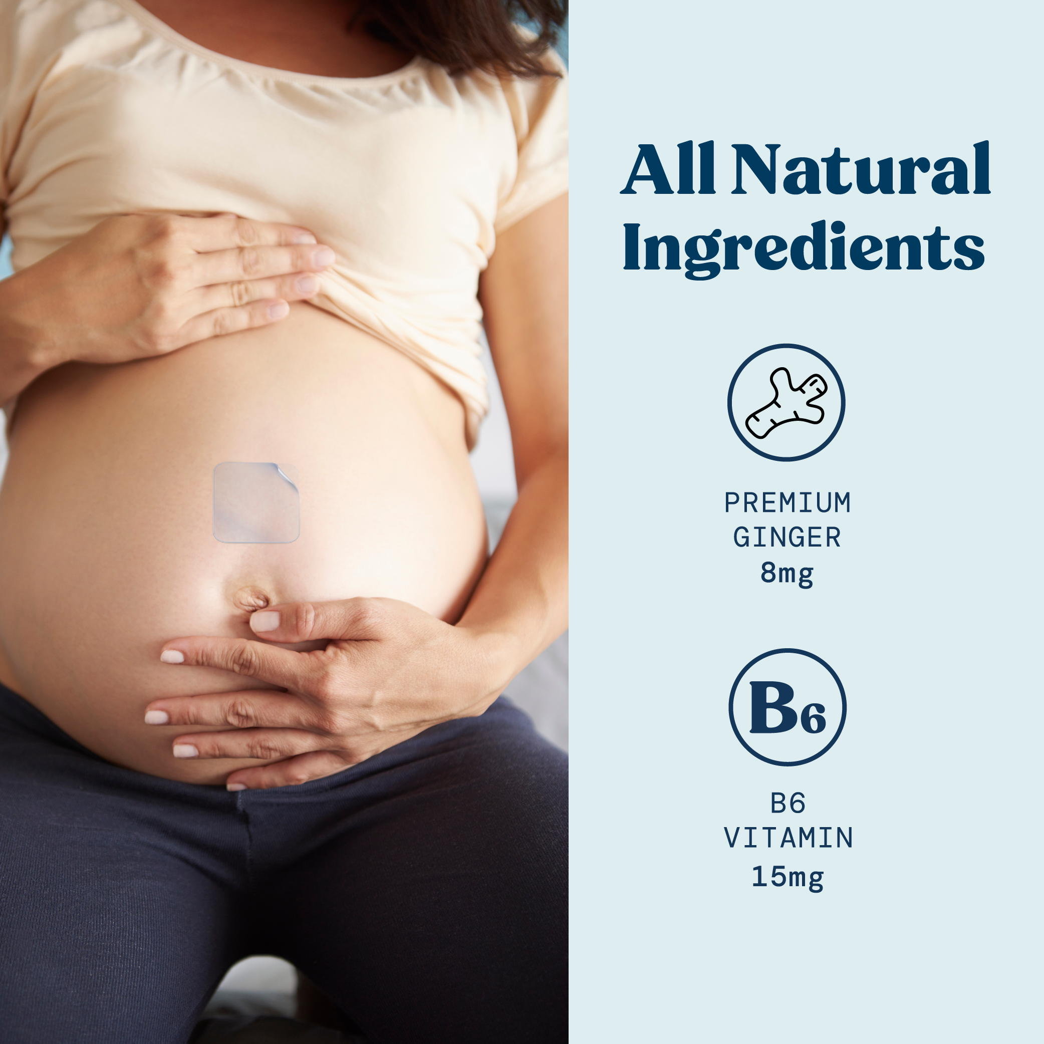
Each listing was carefully designed to balance clarity, education, and visual appeal — with strong consideration for product hierarchy, benefit communication, ingredient storytelling, mobile legibility, and purchase behavior. The goal was not only to create visually compelling assets, but to make product information easier to navigate and more persuasive for busy mothers making quick purchasing decisions.
A scalable visual system was developed across all listings to ensure consistency while allowing flexibility between products and categories.
Combined with the expertise of Amazon marketing specialists, the redesigned experience contributed to supporting approximately 30% brand growth over the course of a year, strengthening both customer trust and product performance.