Case study · Brand identity & design system
Lucy & Jane Matcha —
Building a Brand with Personality from the Ground Up
Client Lucy & Jane
ScopeFull's brand identity · Packaging · E-commerce
Market Women & Men’s Lifestyle · US Foods
The Challenge
A premium product without a visual home
The founder behind Lucy & Jane had something special: exceptional single-origin matcha sourced from small family farms in Japan. But the brand had no visual identity to match the quality of what was inside the tin. The challenge was to create something from scratch — elegant, chic, and cosmopolitan — that could hold its own in a premium lifestyle market while feeling genuinely warm and human.
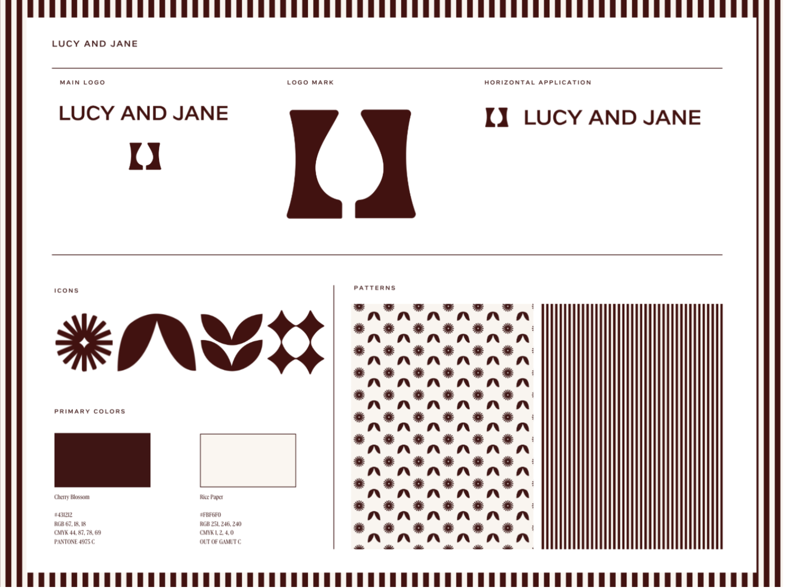
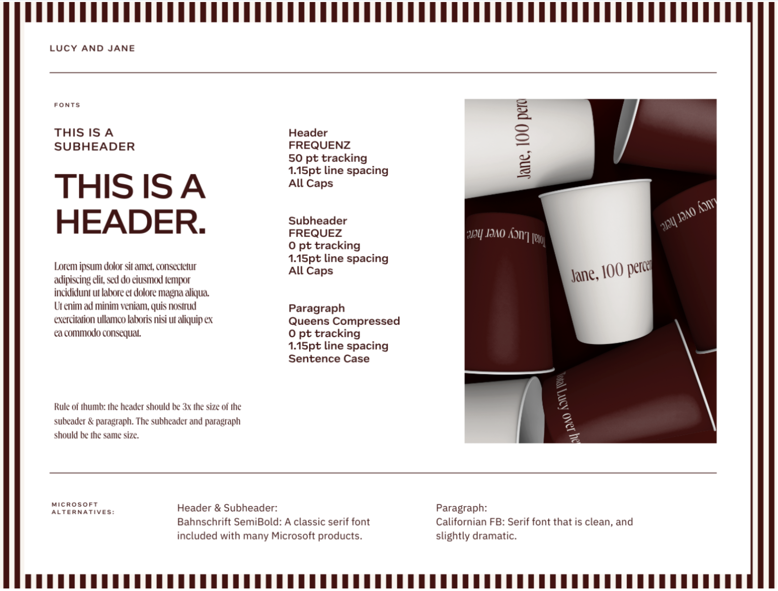
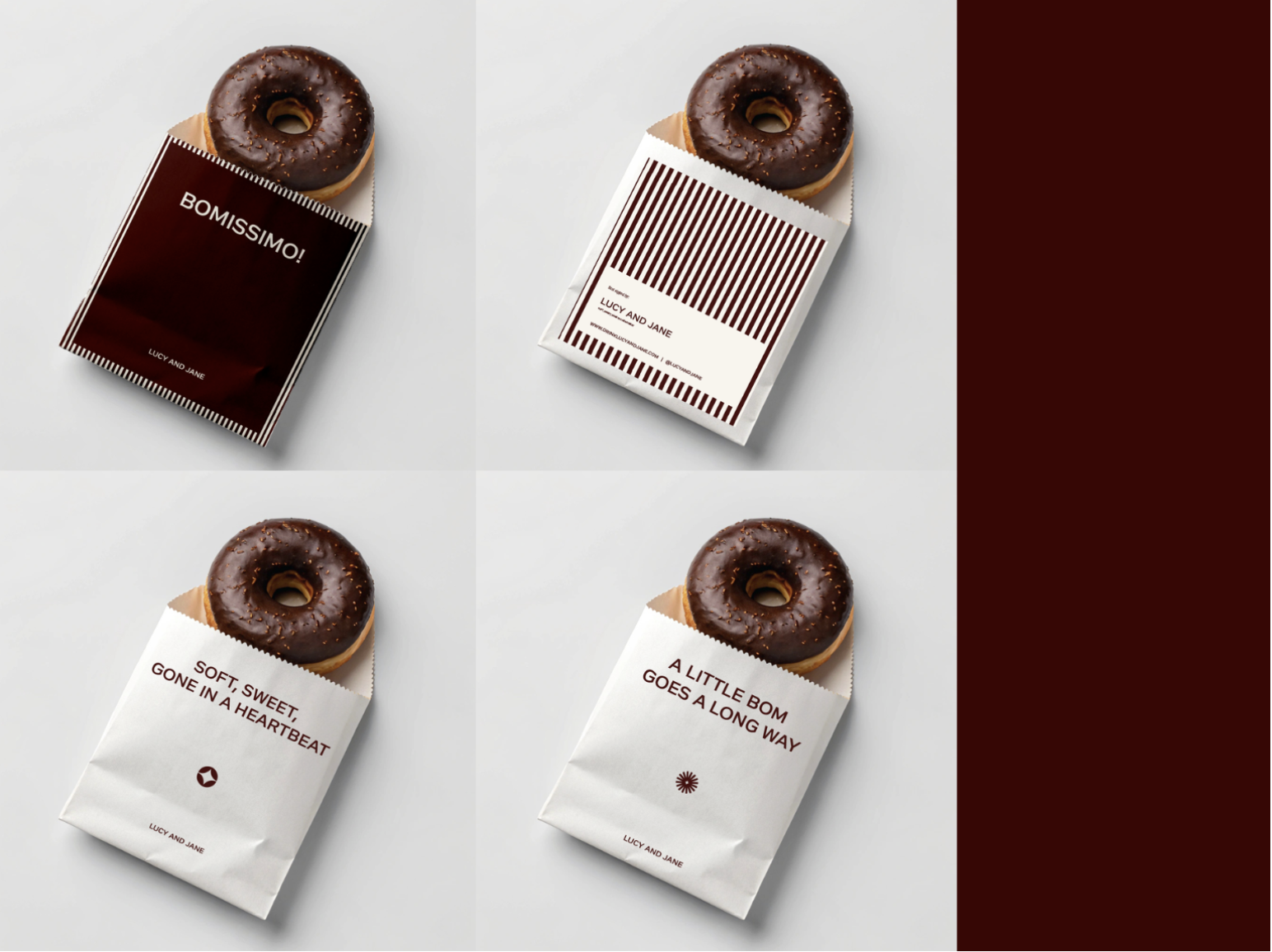
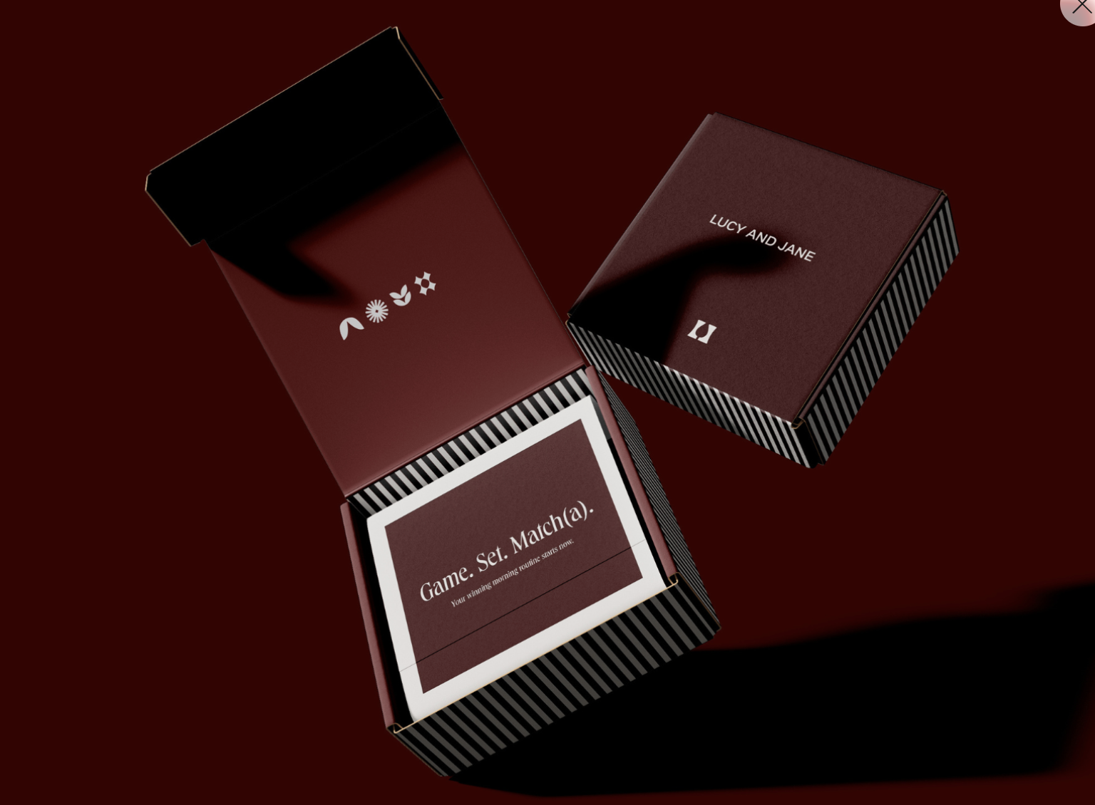
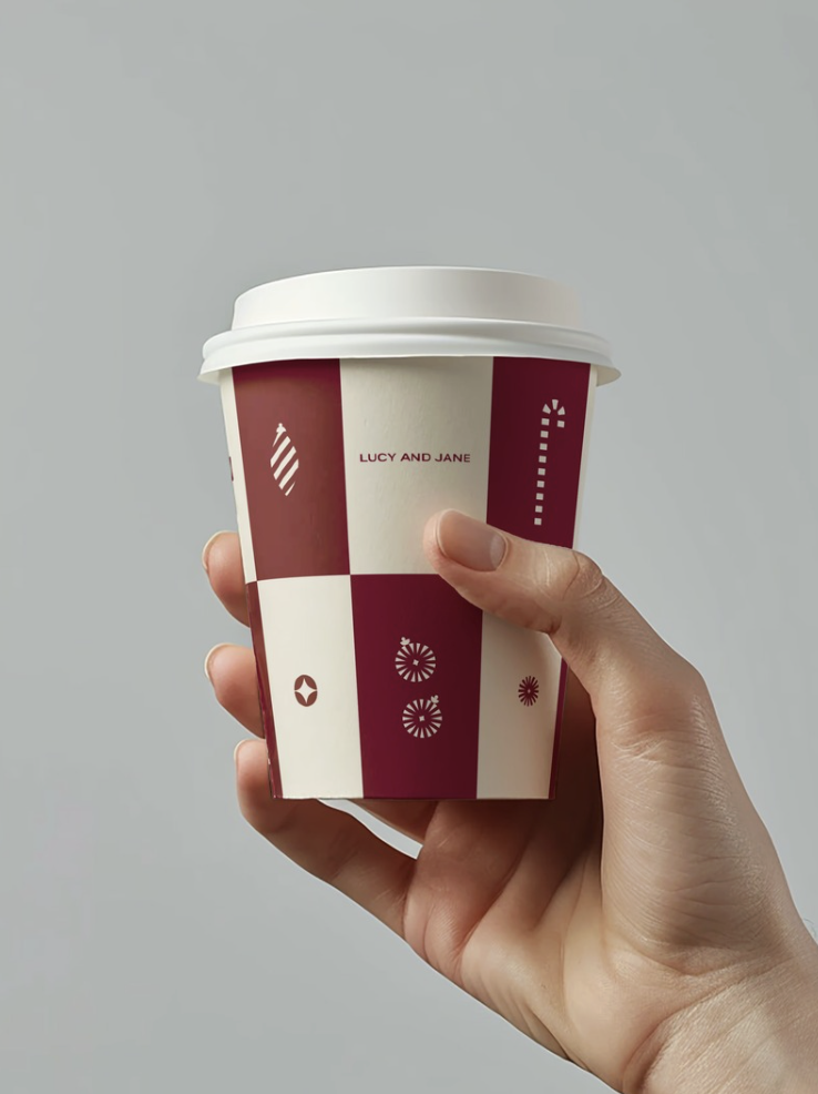
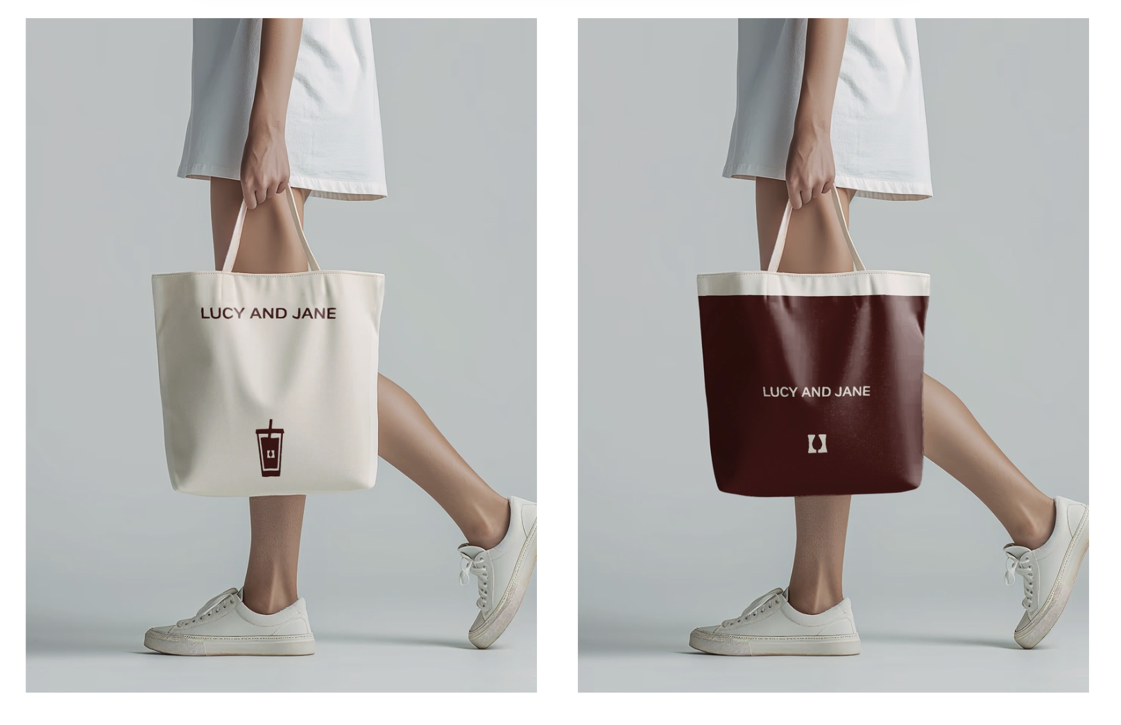
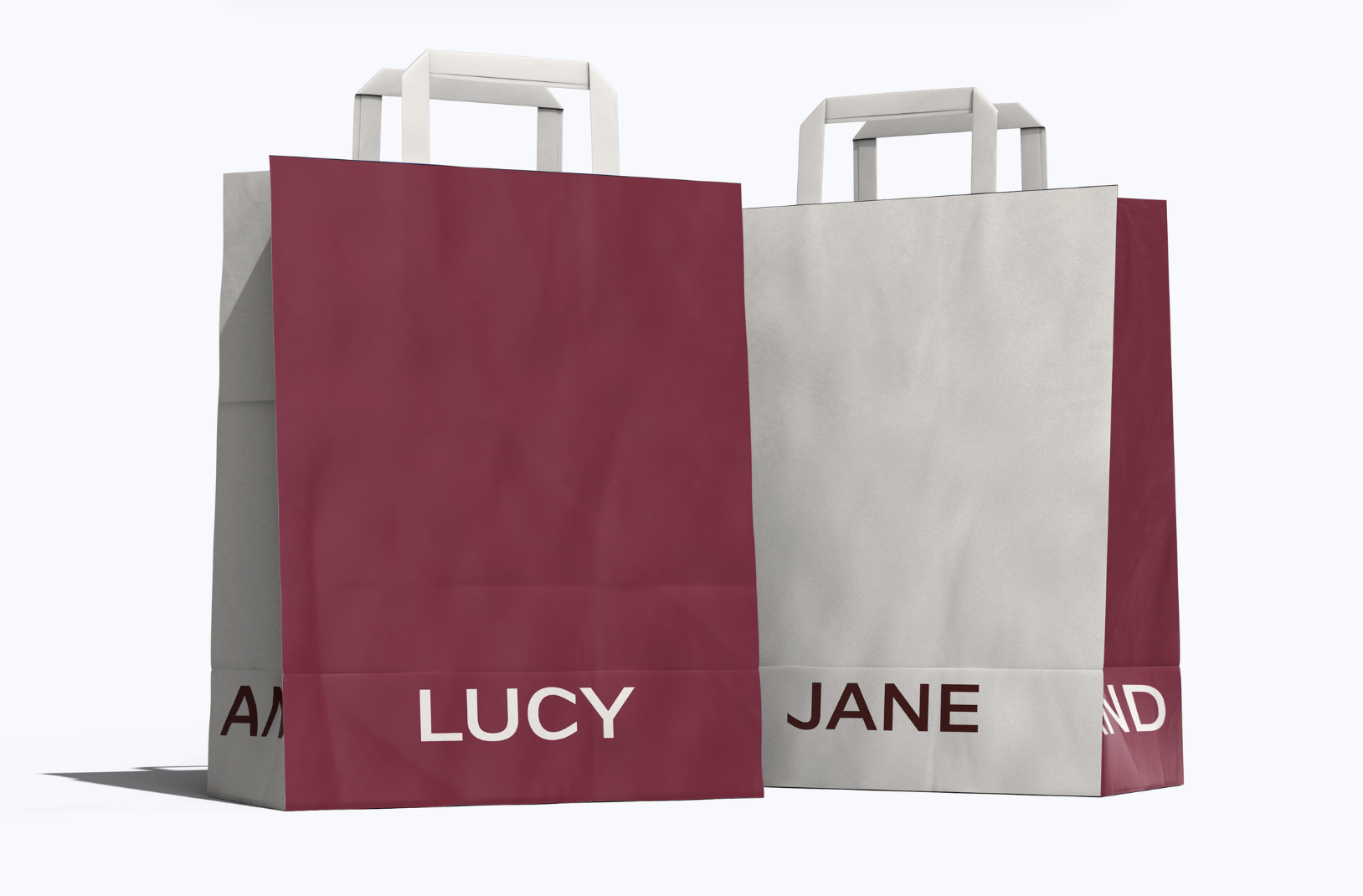
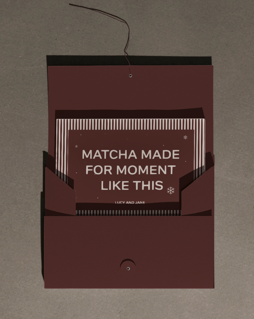
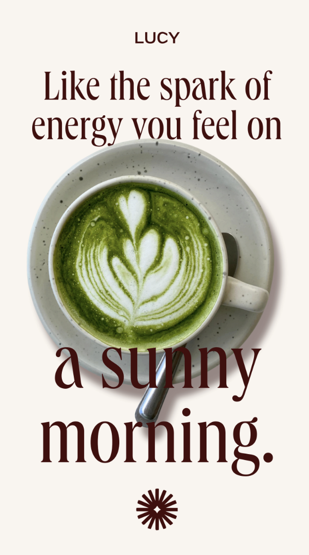
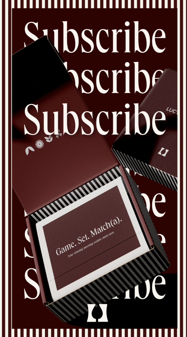
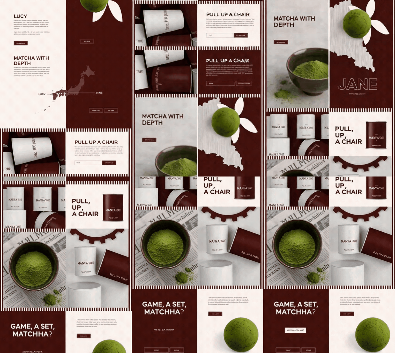
As part of the creative team, I contributed to developing the full visual identity system — from the ground up. The creative concept gave each matcha blend its own personality: Lucy, bold and adventurous; Jane, calm and grounded. That character-driven approach became the backbone of every design decision: typography, color palette, packaging, iconography, and the Shopify storefront.
The goal was consistency across every touchpoint — packaging that felt luxurious on a shelf, a website that felt like stepping into a world, and a visual system flexible enough to grow with the brand.
The Work
A brand built around characters, not just products

The Result
A brand ready for an elevated market
Lucy & Jane launched with a visual identity that punches well above its weight — chic enough for a boutique retail shelf, warm enough to build a genuine community around. Every element, from the logo mark to the product icons, speaks the same language: personality-packed, cosmopolitan, and unmistakably premium.