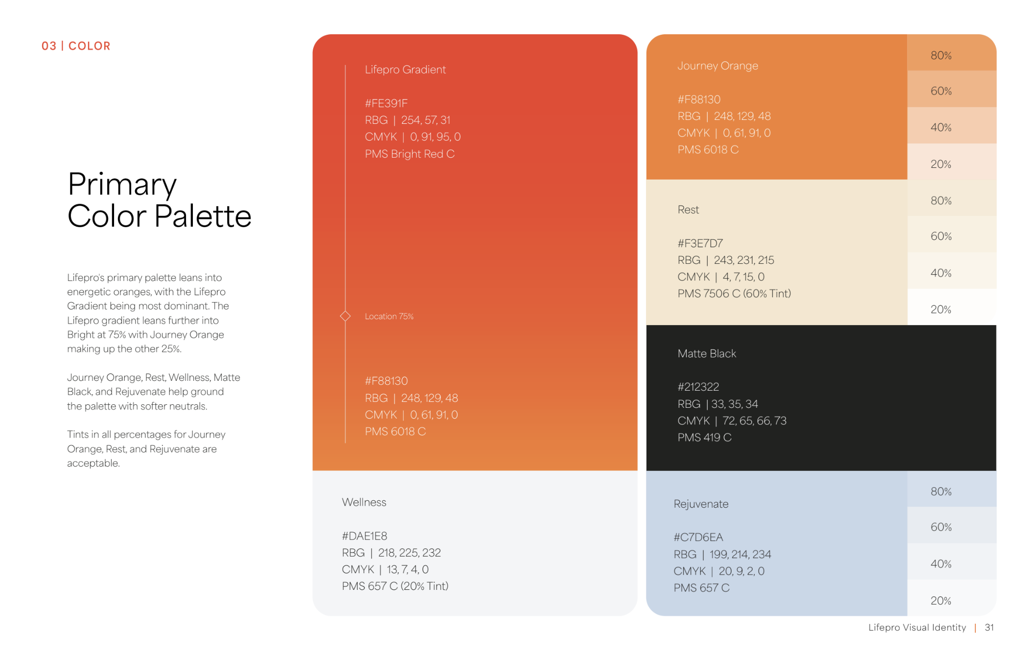
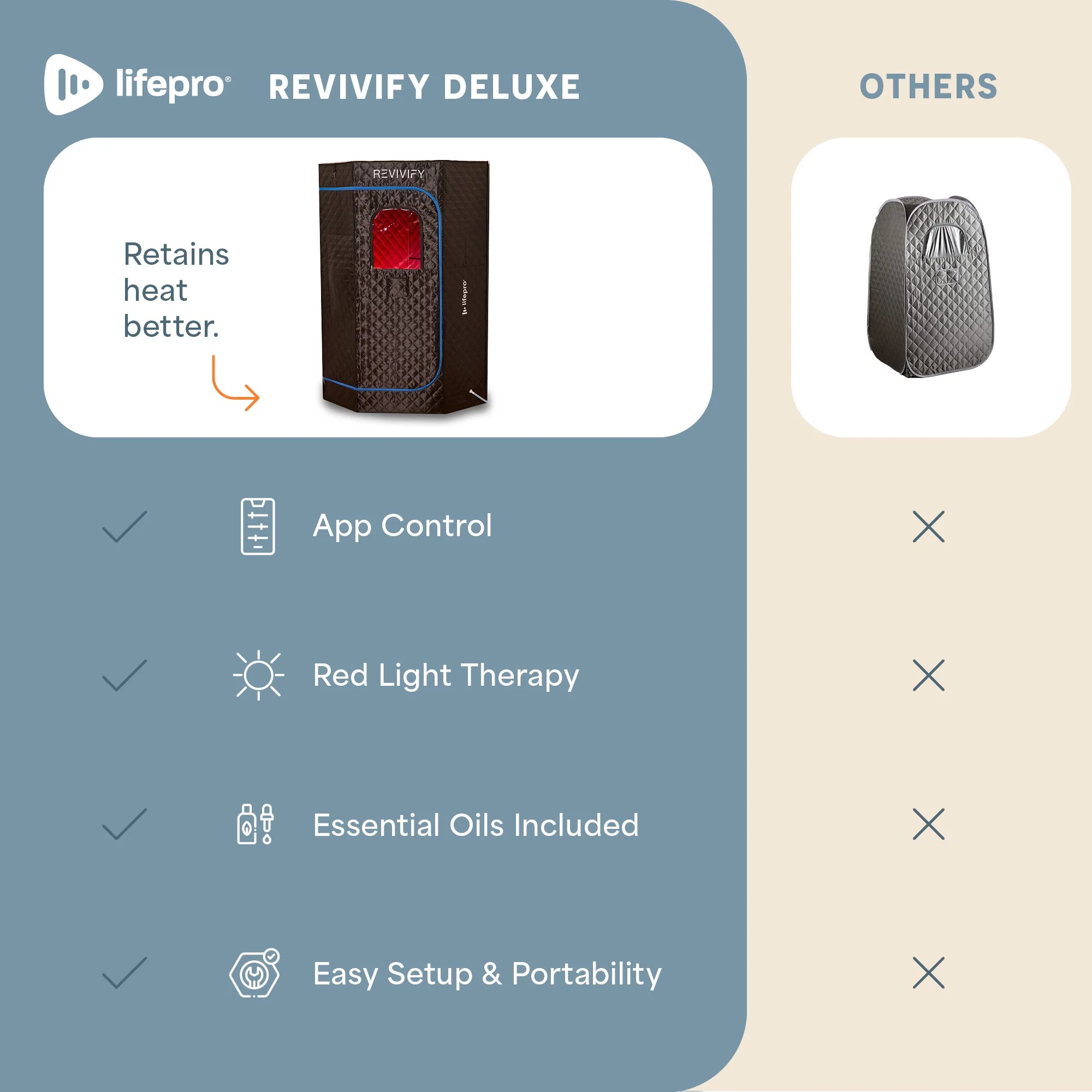
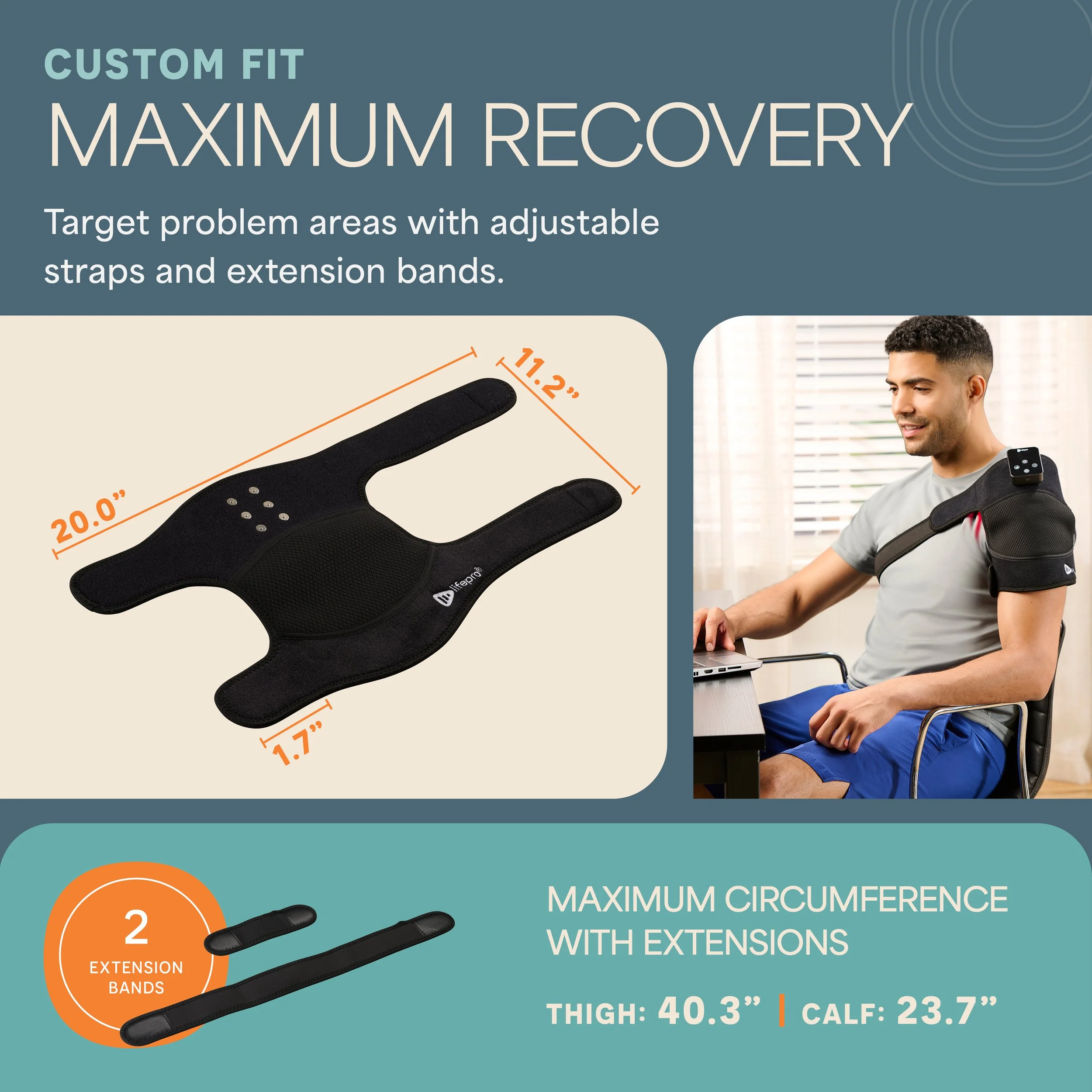
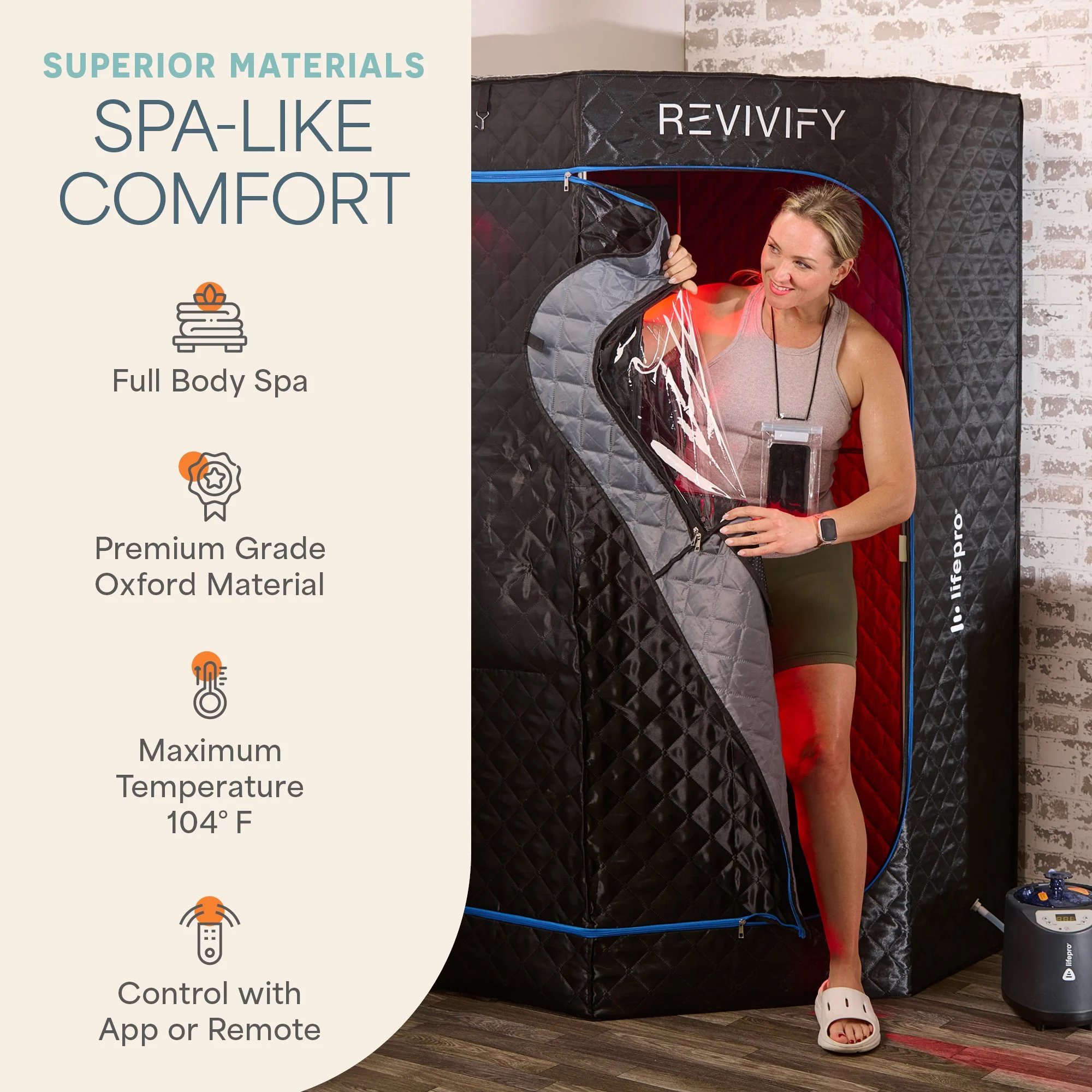
LifePro — Scaling Visual Identity Across 30+ SKUs
LifePro is a fast-growing wellness brand in the fitness recovery space — think percussion massagers, vibration platforms, and performance tools. When I came on board, the brand already had a strong identity system in place. The challenge wasn't to reinvent it. It was to scale it — consistently, across dozens of SKUs, multiple product categories, and a high-volume Amazon storefront — without losing an ounce of visual integrity.


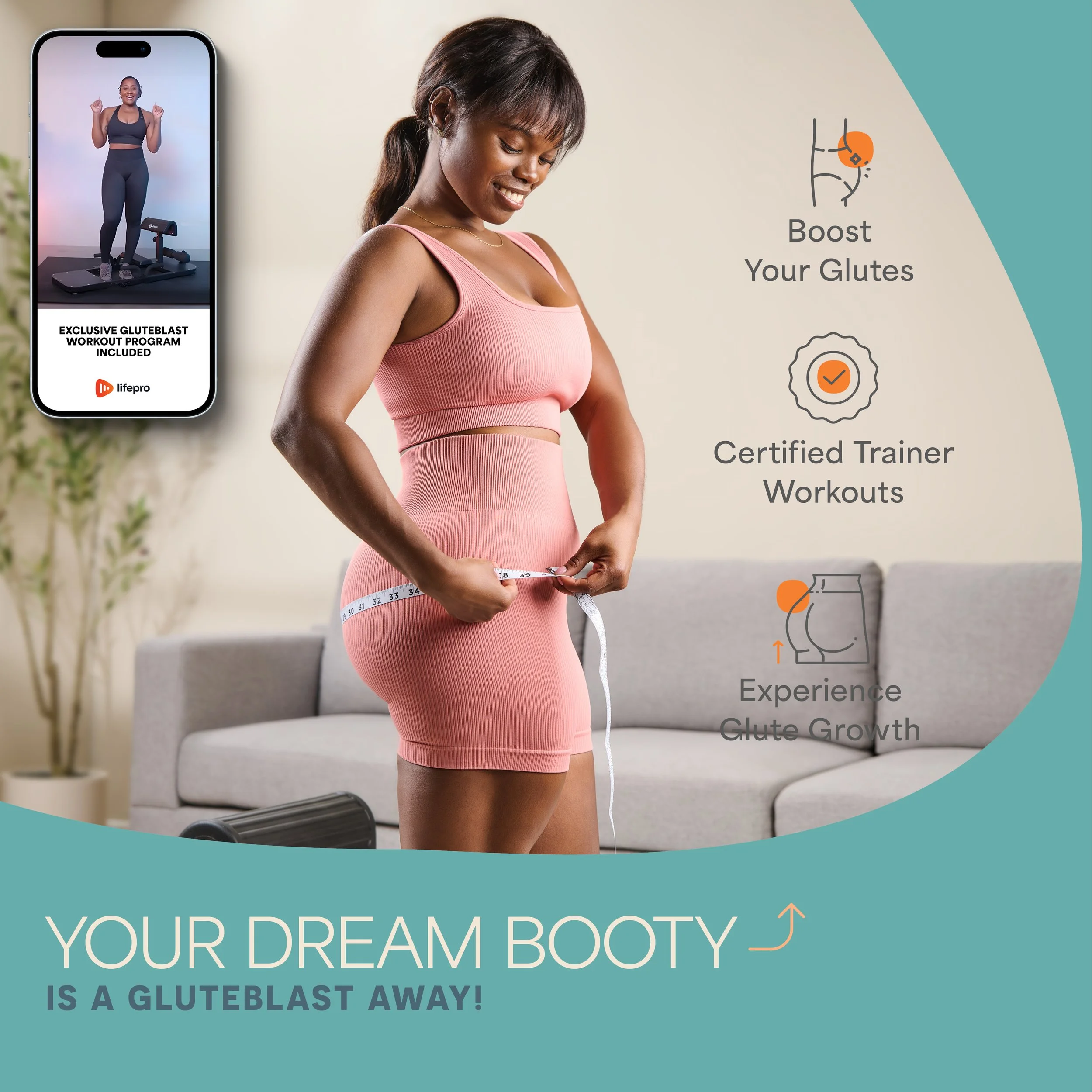
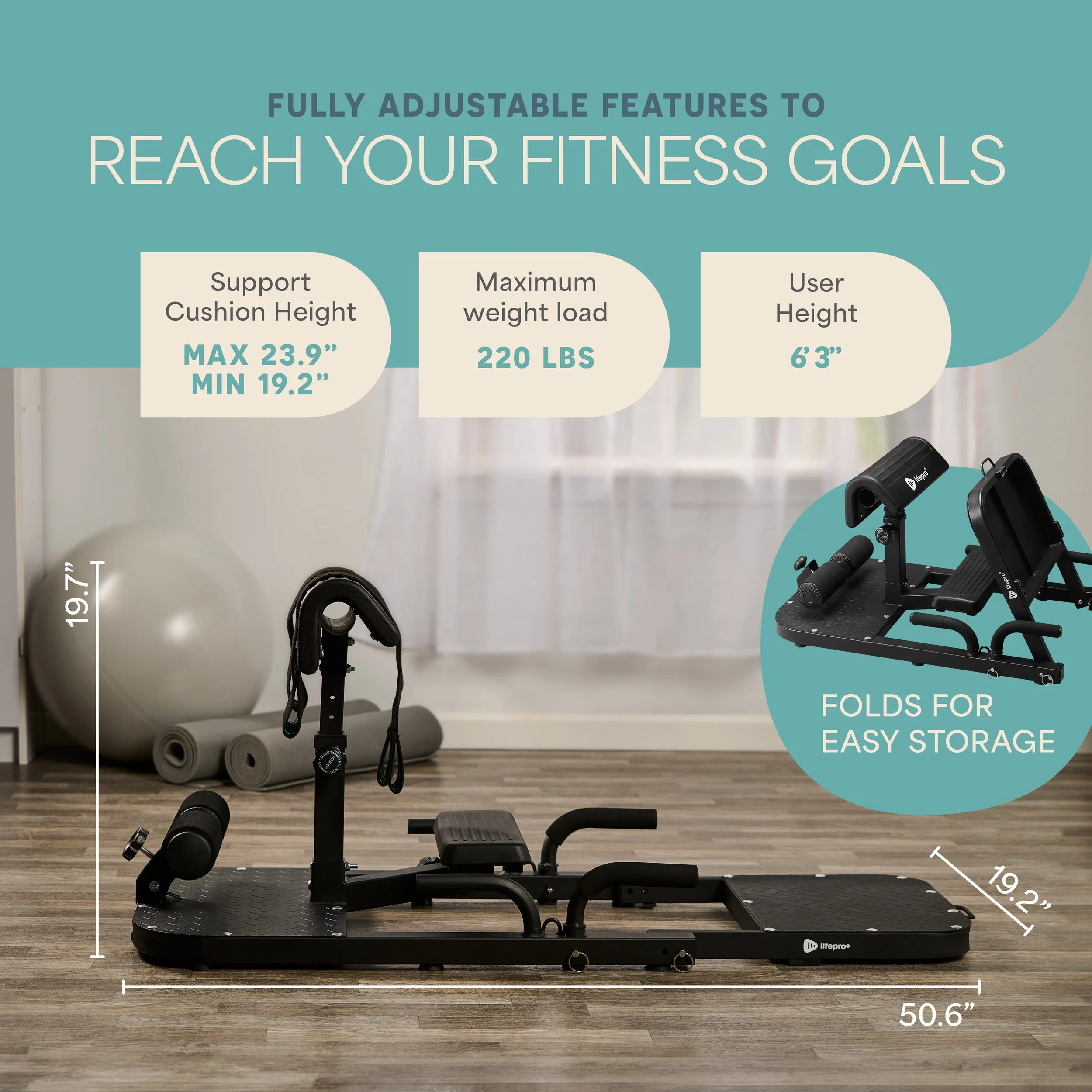
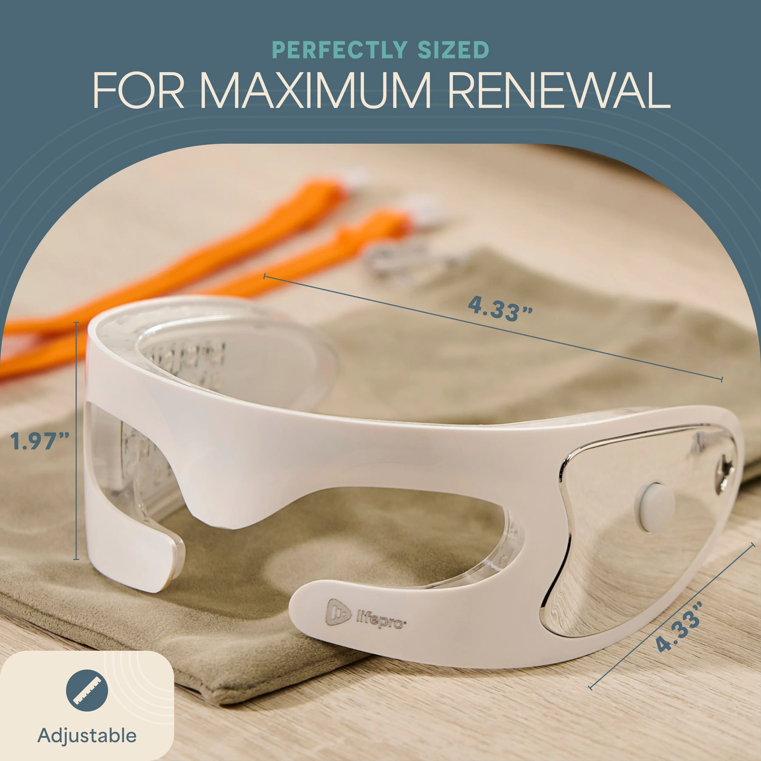
With a strict brand manual as the foundation, I took ownership of the visual production pipeline: Amazon listings, A+ content, packaging, and print inserts.
Each product category — Recovery, Fitness, Wellness — required its own visual logic while staying unmistakably LifePro. The work demanded both creative precision and operational discipline: building reusable templates, maintaining hierarchy across hundreds of assets, and making sure every touchpoint communicated the same premium, performance-driven identity.

The result was a visually cohesive product presence across a catalog of 50+ SKUs — packaging, listings, and inserts that could scale without fracturing the brand. This project reflects what I do best: bringing strategic design thinking to brands that need consistency without creative stagnation. Whether building a brand from scratch or scaling one that already exists, the goal is always the same — design that works as hard as the product it represents.